
This is a linkable HTML version of the MDN Browser Compatibility Report PDF
Why? Because it should be HTML.
Update: It is now.
If every single rendering, regardless of platform, would follow the standard as closely as possible, that would be a beautiful world. – A Web Developer
The challenge of making web sites and applications work consistently across browsers is well known to web developers and designers. In the 2019 MDN Developer Needs Assessment, we learned that indeed it appears to be the overall top pain point when building for the web, with four of the top five frustrations/needs being related:
- Having to support specific browsers (e.g., IE11).
- (Outdated or inaccurate documentation for frameworks and libraries.)
- Avoiding or removing a feature that doesn't work across browsers.
- Testing across browsers.
- Making a design look/work the same across browsers.
The MDN Browser Compatibility Report is a deeper dive into these issues, attempting to identify specific issues causing a lot of frustration, and what could be done to improve the situation. The research consisted of a survey focused on browser compatibility, followed by interviews with 13 volunteers among the survey participants.
This research was conducted by MDN, reviewed by the MDN Product Advisory Board and led by Philip Jägenstedt (Google), Robert Nyman (Google) and Kadir Topal (Mozilla). See acknowledgments for full details.
Summary
Both in the 2019 MDN Developer Needs Assessment and historically we've seen that by far the biggest challenge for web developers is with regards to browser compatibility. We wanted to learn exactly what areas and features are causing this pain, and importantly what we can do to alleviate these, or even make them go away.
To be able to do that we have aimed to provide as much detail and extensive reporting as possible to create a foundation for browser vendors to gain an understanding of the issues and offer them a starting point with as much actionable feedback as possible.
We found that a lot of developers are struggling in particular with layout and styling issues: CSS Flexbox, CSS Grid and problems achieving consistent layout in recent browsers with dynamic viewport sizes and scrolling. JavaScript was often mentioned, but turned out not to be problems with the core language and instead numerous challenges with achieving browser compatibility with various Web APIs.
We heard about challenges with all major web browsers, and the largest number of compatibility challenges were reported for Internet Explorer and Safari.
By preemptively sharing initial findings with browser vendors and working closely with engineering teams, we've already seen concrete results and improvements regarding:
- CSS Flexbox and Grid improvements in Chromium and WebKit
- Commitment to improved browser compatibility data on MDN
WIth Chromium-based Edge rolling out with Windows updates we believe reported issues with Microsoft Edge Legacy and Internet Explorer will decrease.
We further plan to run the MDN Developer Needs Assessment survey again to both surface new issues and see if existing ones have been addressed, and establish an even closer collaboration between browser vendors to ensure compatibility for a better platform for web developers.
Survey
The goal of the survey was to identify which individual features and browsers contribute the most to web developer pain points around browser compatibility. The target audience for the results is browser vendors, and we wanted the findings to be as actionable as possible and make sense as input for prioritization.
In short, the survey asked about:
- Overall satisfaction with the Web (on a scale)
- Satisfaction with browser compatibility (on a scale)
- Overall top pain point with browser compatibility (free-form text)
- Feature areas that cause issues (fixed options)
- Browsers/platforms that cause issues (fixed options)
See appendix A for the full set of questions.
The survey was run on MDN in February/March 2020, and was also promoted on Twitter, web.dev and developers.google.com in that period.
The 3,236 complete responses are available in redacted form in a public spreadsheet. (The free-form responses were removed as they could and did occasionally include personally identifiable information.)
Categorizing Responses
The survey's main free-form question "Overall, what is your top pain point with browser compatibility?" was categorized by hand and used to filter the results.
Only 64% of the responses answered this question, and those 2000+ answers were categorized manually into 46 categories, up to 5 categories per answer. We used the first or most prominent issue as the first category. For example "I don't really like that chrome and firefox handles images inside flexbox differently" was categorized as Flexbox, Chrome and Firefox, with Flexbox taken to be the top issue.
See appendix B for all categories and examples.
Responses that looked like bot activity or not possible to interpret were classified as invalid. These were 20% of the total number of responses.
This process resulted in 1,429 valid responses (44%) and 1,807 excluded responses (56%) where the latter includes both missing responses (36%) and invalid responses (20%).
Filtering Responses
In our analysis, we decided to include only the valid responses, effectively using our free-form question as a screening question. Generally, in the excluded subset, the distribution between options is more even, which is consistent with more random noise. However, it was not just noise and some proportion of those responses must be from real, experienced web developers. Unfortunately, it's not possible to identify them without making some assumption about what a good response looks like, which would likely only bias the results to what we already think is reasonable.
This represents a flaw in the survey design. The free-form question should have been required so that more of the responses could be identified as valid. This likely biased the results in some way.
Because of this screening and that only 29% of the used responses came from MDN, the results can't be directly compared to the 2019 MDN Developer Needs Assessment.
Results
The high-level survey results are summarized here. See appendix C for full results, and the Findings section for a synthesis of survey and interview results with much more granularity.
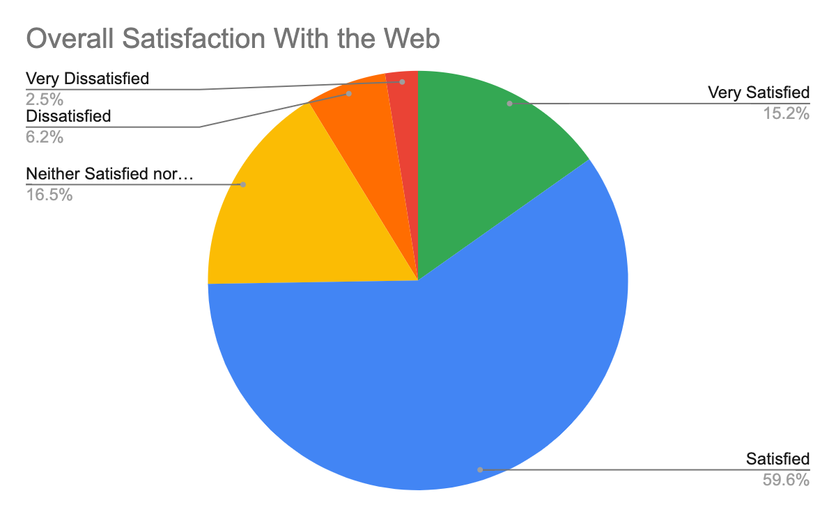
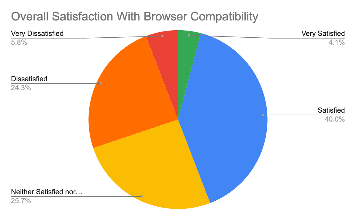
Satisfaction with the Web vs. browser compatibility
Overall for the Web, almost 75% are satisfied or very satisfied, which is very close to the 2019 MDN Developer Needs Assessment results. The comparable number for browser compatibility is 44%. This is a marked difference:
Overall top pain points
The ranking of overall top pain points is based on the aforementioned categorization of free-form text responses. The percentages indicate what percentage of valid responses mentioned the issue, and do not add up to 100%.
- 24% Internet Explorer
- 20% Layout and styling
- 17% Safari
- 10% General (expressing the broad problem of browser compatibility)
- 7% Old browsers
- 6% Chrome
- 5% JavaScript
- 4% None (expressing that browser compatibility isn't a pain point)
- 3% Slow adoption
- 3% Firefox
- 3% PWAs
- 3% Edge
Feature areas that cause issues
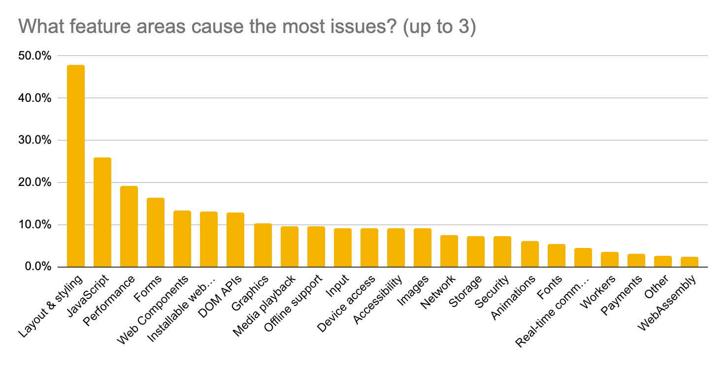
- 48% Layout and styling (CSS, responsive layout, etc.)
This is further broken down below. - 26% JavaScript (core language)
Understanding this became a focus of our interviews, see findings. In our estimation, JavaScript itself does not appear to be a major problem. - 19% Performance (APIs, scrolling, smooth animations)
See findings for more details. Scrolling was also a focus of our interviews, see also those findings. - 16% Forms (autocomplete, styling, etc.)
See findings for more details. - 13% Web Components (shadow DOM, custom elements)
- 13% Installable web apps (installation, notifications, etc.)
- 13% DOM APIs (modifying elements, editing, selection, etc.)
This ranking is fairly consistent with the top paint points ranking, but Web Components were mentioned less frequently in the free-form responses than PWAs (installable web apps) and APIs.
Layout/styling feature that cause issues
We anticipated that layout and styling would be among the top pain points, and asked a second question for those who chose it. (685 responses)
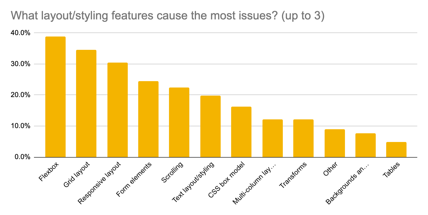
- 39% Flexbox
See findings for more details. - 35% Grid layout
See findings for more details. - 31% Responsive layout
See findings for more details. - 25% Form elements
See findings for more details. - 23% Scrolling
See findings for more details.
This ranking is largely consistent with the top paint points ranking, although forms were mentioned more than CSS Grid, and responsive layout wasn't one of the categories for that question.
Browsers/platforms that cause issues
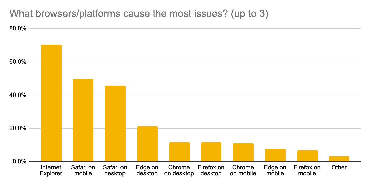
- 70% Internet Explorer
- 50% / 46% Safari on mobile / desktop respectively
- 21% / 8% Edge on desktop / mobile respectively
- 12% / 11% Chrome on desktop / mobile respectively
- 12% / 7% Firefox on desktop / mobile respectively
This ranking is consistent with results of the top paint points ranking, with the exception of Edge which was mentioned less than Firefox there.
See findings for more details on each browser.
Questions
After reviewing the survey responses we had some questions about things that we had not expected or didn't understand in the results. In particular, we were surprised to see JavaScript (core language) rank #2 among feature areas.
For layout/styling features we also wanted to understand more about the pain points participants had in mind when choosing responsive layout.
Finally, we wanted to get a few more concrete examples of pain points around Internet Explorer, Safari, CSS Flexbox and Grid, as these were the top categories in overall top pain points. However, these were deprioritized after a few interviews, see below.
Interviews
To add more detail to our survey results, we recruited participants to an interview study from those who agreed to be contacted again. Roughly 100 survey respondents were contacted, based mostly on what they had written in the free-form survey questions. The accept rate was higher than expected, so we ended up conducting 13 interviews.
Most of the interview participants were very experienced, with 2 participants having 20 years of experience and 8 more falling in the 5-15 range. We don't know if this is representative of all survey participants, but suspect the interview participants were more experienced on average. Most of the participants were building for both desktop and mobile. We had a mix of developers working in-house vs. agencies, and also a mix of public (general audience) vs. internal web properties.
We did not ask exactly the same questions of all participants, and after the second day of interviews we decided to deprioritize the goals/questions around Internet Explorer, Safari, CSS Flexbox and Grid. This was because we found there was more to learn about the other topics, where we had more unanswered questions. These deprioritized topics still came up naturally in some interviews, however.
The main findings from the interviews were:
- Responsive layout: When asked about responsive design, most participants brought up issues around viewport size/units, scrolling, as well as their use of Flexbox, Grid, etc. These led to the detailed findings below. Contrary to our expectations, we did not hear about challenges with media queries, one of the building blocks of responsive design.
- Viewport: Covers dealing as a developer with the dynamic viewport size on mobile and adapting the content to the visual viewport. A lot of this is around how the vh unit interacts with the URL bar on mobile browsers, and originally being different across mobile browsers. Getting desired results is still hard for developers.
- Scrolling: A number of challenges around scrolling were detected, such as customization of scrolling, APIs to control it, events that fire during scrolling, and scroll performance. We've confirmed that there are many differences between mobile browsers, causing a lot of developer pain. Identified use cases include when JavaScript scrolling has been implemented to address native scrolling shortcomings, such as overscroll and scroll snapping.
- JavaScript: Most participants had no issues with the JavaScript language itself, and many of them attributed this to use of transpilers like Babel. Even those few participants that wrote mostly vanilla JavaScript without any tooling didn't feel that browser compatibility was a big problem. We suspect that when survey participants selected "JavaScript (core language)", this was driven mostly by issues related to JavaScript, but usually not the core language.
These and other findings are incorporated into the following section.
See appendix E for the full study goals and discussion guide, and appendix F for partial interview transcripts.
Findings
This section brings together findings from the survey and interviews with some additional context to try to paint as detailed and nuanced a picture as possible of the top pain points relating to browser compatibility. It is organized into features, browsers and [other themes](#other-themes.
Features
Through the survey and interviews we heard about many issues, ranging from very specific bugs to a general sense that a feature isn't ready to use. In this section we cover roughly the top four feature areas that cause issues. The first two of these were the focus of our interviews.
CSS Flexbox
Flexbox was the most selected option (39%) for layout/styling features causing issues. It was also the specific feature most often mentioned (39 times, 2.7%) in free-form survey responses.
That compatibility issues with Flexbox are top-of-mind is consistent with the high awareness and usage of the feature. In the State of CSS 2019 survey almost everyone knew about Flexbox and 95% used it. Usage in the wild is around 70% of page views, per chromestatus.com.
We heard about issues both with old browsers like Internet Explorer, but also difficulties achieving a consistent layout in recent browsers. Notable issues are support for gap (gutters) and bugs around the sizing of "replaced content", like images and fieldset. Several of these are in the process of being fixed at the time of writing.
Web developer quotes
A selection of quotes from the survey responses:
Flexbox bugs in all major browsers except for the old EdgeHTML version of Edge
I still find differences in flexbox and grid. I also had one with object fit recently. When the image was 100% tall Chrome would shrink the image height. Other browsers tried to show the full image height as expected.
I don't really like that chrome and firefox handles images inside flexbox differently
Chrome's calculation of flex with overflow really bit me. While Firefox and Safari were doing the calculation correctly. I had to read a bunch of bug tickets to find out that adding min-height to my div was needed.
Chrome doesn't support the gap property with Flexbox. https://bugs.chromium.org/p/chromium/issues/detail?id=762679
Internet Explorer (still supporting 11) especially regarding Flexbox.
Long standing bugs in only one browser, such as the flexbox bug with fieldset in chrome. Just fix it already.
Flexbox also came up in some interviews. One participant reported this as their main pain point, especially with vertical layouts:
Most of the problems I've had have been with Flexbox. Especially when you apply Flexbox in a layout you have to be aware of the different syntax for different browsers, and that's really painful. If you forget something you can have issues in some browsers. I've had a lot of problems with vertical Flexbox and Safari, for example. Even having a specific syntax it doesn't behave the same way, I think, in vertical Flexbox. Where you apply Flexbox to columns and not rows and want to center whatever content vertically, I've had a lot of issues with that. Specifically things like flex auto, flex 100%, I've been having to apply that specifically for Explorer and Edge. […] I wasn't able to fix it, so I had to get rid of Flexbox, finally, and apply table displays for what I wanted to achieve. […] The layout was: everything was vertically centered in the layout, the whole content, and it had to be always centered in the screen, in the browser, and I couldn't use Flexbox for that. I also think we normally tend to use Flexbox for things that it's not intended for, and I think that's because we didn't have CSS Grid until now, until very recently.
Another interview participant reported problems achieving the same height of Flexbox layouts cross-browser:
We had a carousel, and all the slides should have the same height, the height should be dependent on the highest slide. So Flexbox, Flexbox, another Flexbox, all nested inside each other. We didn't start from scratch, obviously, we just used a slider component that was already there. The slider component is not the issue here, in this case. Flexbox had differences between Firefox and WebKit- or Blink-based browsers. We couldn't achieve these equal height slides on anything but Gecko. In Gecko it worked fine, in all other browsers it did not, so we also needed to have a JavaScript solution here. Doing layout calculations in JavaScript is never clean, it always feels a bit dirty, but in this case the slider's based on JavaScript anyway, so we made this tradeoff. […] The way Glide.js works is you get a container where all the slides are stored and it uses Flexbox for display values, as far as I know. You should usually be able to give each slide the same height, but it didn't work in anything but Firefox. Don't know why.
Among the things that bug me the most, it's mostly little differences in Flexbox implementation. Of course we have to support IE11, but even in other browsers you see a lot of differences. This is something you face almost on a daily basis. You know your way around it, especially with IE11, after a while. But I think there are still some bugs that remain, even in modern browsers.
Finally, one interview participant expressed that Internet Explorer had been especially problematic with regards to Flexbox:
All the Flexbox gotchas that IE has are pretty frustrating, and I'm intimately aware of many of them. This is actually the first time I've not had to support IE in my career, so it's pretty nice. […] A lot of the flex issues were around height and flex-grow or flex-shrink. Just simple things like explicitly setting a height on the flex child would fix the issues.
Flexbox in Internet Explorer
Internet Explorer 11 supports Flexbox without prefixes but with a number of well-known issues, many of which were fixed in Edge. Several comments suggested that Flexbox is a bigger pain point when supporting Internet Explorer.
In appendix D we looked at the survey responses that did not indicate any issue with Internet Explorer, and Flexbox was no longer the most selected option for layout/styling features causing issues. However, it does still appear to be a significant pain point.
See also
- Flexbox on MDN
- Flexbox and gap on caniuse.com
- Flexbox test results on wpt.fyi
- Flexbugs list of flexbox issues and cross-browser workarounds
Chrome bugs
These are the specific Chromium bugs we were able to identify:
- [css-flex] Add gutters support in Flexbox
- [css-flex][css-grid] Flexbox/grid layout model does not work on fieldset elements
- [img flex-basis] Flexbox doesn't scale down images correctly
Firefox bugs
This is the specific Firefox bug we were able to identify:
Safari bugs
These are a few specific WebKit bugs we were able to identify:
- [css-flexbox] Implement row-gap and column-gap for flex layout
- [css-flexbox] min-height: auto not applied to nested flexboxes
- [css-flexbox] min-height:auto not updated after an image loads when the image has a specified height and width
CSS Grid
Grid was the 2nd most selected option (35%) for layout/styling features causing issues. It was also frequently mentioned (23 times, 1.6%) in free-form survey responses.
The State of CSS 2019 survey suggests very high awareness but less usage of Grid than Flexbox. Usage in the wild is around 6% of page views but growing steadily, per chromestatus.com.
The source of frustration with Grid appears to be different to Flexbox. When supporting old browsers, mainly Internet Explorer, Grid support is limited. In more recent browsers, one issue that came up multiple times is support for Subgrid, which at the time of writing is only supported in Firefox. We did not hear about other issues, and one developer saw Grid as a success story.
Web developer quotes
One interview participant expressed that supporting Internet Explorer limits the use of the latest grid features:
We have to support IE11 and Grid support is limited. This often requires heavy workarounds, so you always have to do a lot of things with the help of additional JavaScript that you wouldn't need to do otherwise.
Simple grids work in IE11 as well, it's often much easier to do things even without having all the latest grid features available. For other projects I'm starting to transition to grid layout. I wouldn't say I use it 100%, Flexbox also has its use cases. I think back then I avoided using Grid, I still try to get around it especially with older devices in mind.
Another participants, who also did support IE11, instead expressed how CSS Grid has been a success story for them, in terms of being implemented in all browsers and behaving correctly:
We're starting to use it right now. I think it's kind of becoming stable right now, all browsers have implemented CSS Grid. I don't think you can use it for every kind of layout, either, it depends on the layout you want to implement, but it's really useful. And it behaves correctly, I think that's been one of the great things, because every vendor has implemented that, and that's been like a success for us. Because you're sure you can use it and you're not going to have big issues with it. So that is great, yes.
See also the Responsive layout section for a related finding, where Bootstrap's grid system was credited with fixing (or avoiding) some issues. (Note that Bootstrap's grid system is built on Flexbox, not Grid, so this doesn't say much about CSS Grid.)
Finally, a selection of quotes from the survey responses:
Not being able to use ES6 or CSS Grid years after their introduction, having instead to still rely on outdated, hacky workarounds.
Slowness in Chrome to implement new CSS layout like gap for Flexbox or subgrid.
I want to use css grid, flexbox etc but I still need to support legacy safari
Grid in Internet Explorer
Internet Explorer 11 supported an -ms-prefixed version of CSS Grid.
In appendix D we looked at the survey responses that did not indicate any issue with Internet Explorer. In layout/styling features causing issues, Grid then appears to be much less of a problem, falling from #2 to #6 in the ranking.
This together with interview comments suggest that when supporting Internet Explorer, Grid is a significant source of issues or cannot be used, but that in more recent browsers, Grid is much more interoperable and less of a pain point.
See also
- Grid and Subgrid on MDN
- Grid and Subgrid on caniuse.com
- Grid and Subgrid test results on wpt.fyi
- Gridbugs list of bugs, incomplete implementations and interop issues
- [css-grid] Implement subgrid support Chromium bug
- [css-grid] Add support for subgrid (Grid Level 2) WebKit bug
Responsive layout
Responsive layout (or responsive design) can mean many things, and in our extra question about layout and styling features we did not specify exactly what this meant. This option was ranked #3 overall and tied for #1 when excluding IE.
However, "responsive" was only directly mentioned a handful of times in free-form survey responses. Rather, the clearest theme that might be related was dealing with the dynamic viewport size on mobile: mainly how viewport units work and the effect of URL bar on the viewport size and scroll/resize events.
Understanding the pain points that web developers associate with responsive layout became a main study goal for the interviews. The question to interview participants was typically asking for a recent time when they'd had trouble making a design work on both desktop and mobile, only sometimes directly mentioning "responsive layout" or "responsive design." This often led to a discussion of issues pertaining to scrolling, and where not we would sometimes ask about that separately.
Findings from these part of the interview study are in the following sections:
- Viewport issues, namely dealing with the dynamic viewport size on mobile and adapting the content to the visual viewport.
- Scrolling issues, like customizing vertical and horizontal scrolling, APIs for scrolling, events that fire during scrolling, and scroll performance.
It's also notable that two interview participants mentioned using the Bootstrap grid system when asked about desktop/mobile/responsive issues. One of them explained why it's helpful:
We use a grid system from a project called Vuetify, which is part of the Vue ecosystem. It's based on the Bootstrap grid system. It's well tested, it's cross-browser, so fortunately we don't have to worry too much about layout issues. […] Just having a grid system that's well supported and tested by other parties is a super helpful tool.
The other participant reported running into a problem on that same day, which was fixed by a newer Bootstrap release:
My colleagues asked me for support for a newly made application in another team. It was due to a bug in Bootstrap 3. There was a box which went on a new line in only iOS, just today. It was a bug on the grid of Bootstrap 3, which was fixed in Bootstrap 4.
While we did not get details about these cases, clearly frameworks smooth over some differences between browsers, and developers can benefit from that.
Viewport
The viewport is the part of a page visible to the user, and is something every web page designed to work on mobile devices has to consider. The issues raised were mostly about how the vh unit interacts with the URL bar on mobile browsers, explained in the "The trick to viewport units on mobile" article on CSS-Tricks. Another factor here might be about not having a specification for the viewport. These issues are tightly linked to scrolling.
Part of the frustration can be attributed to the behavior of vh units originally being different across different mobile browsers. It could also be about a discrepancy of understanding about the vh unit between developers and the CSS WG, see [css-values-4] Add vhc value.
While Chrome 56 changed its behavior to match Safari on iOS, some developers may not have noticed this, and it remains difficult to achieve the desired effect. There is an open CSS Working Group issue to address this. In the meantime some developers have turned to -webkit-fill-available or JavaScript workarounds.
The effect of scrollbars on the vw unit also came up, and was the subject of another CSS Working Group issue, resolved as "Drop the requirement to subtract scrollbar size from vh/vw units for overflow scroll." While not a browser compatibility issue, a platform compatibility issue of sorts remains, as some platforms have classic scrollbars and some have overlay scrollbars. Some are also implementing their own scrollbars and hiding the native one.
In response to these findings, Chrome's input team did some investigation of viewport units, confirming that Chrome and Safari now have the same behavior.
Web developer quotes
In our interviews, one participant told us about viewport sizing issues and the workaround they use:
Then there's the odd viewport sizing in iOS that was a little bit of an annoyance. I kind of read the whole, long bug tracker thread in the WebKit forum about why they decided to size the viewport units the way they did. And it makes sense, I understand the logic, but we did have to figure out a few workarounds for a couple of our screens.
On iOS, as I'm sure you know, as you're scrolling the address bar will collapse. The viewport size is calculated based on the collapsed size of the header. If you want, say a full page screen, that fills the screen but no more, then you can't use viewport units. There is some webkit-specific stuff baked into Safari that we ended up using that will avoid that problem. But that was one of our initial stumbling blocks when we were trying to have a full-screen, non-scrollable view in mobile Safari.
We use -webkit-fill-available to handle that. That was the primary fix we found for the 100vh size issue in mobile Safari.
Two other interview participants also reported having issues with viewport units, either accepting that things didn't look right or using JavaScript workarounds:
It was either something about vw or vh for the viewport width and height. Or percentages for widths and heights. It was some irregularity with that, and although it was perfect on Chrome and Firefox, it just did not look correct on Safari. We still support it, because it still works with the dashboard that we've been building, but some of the things don't just quite look right.
Also things like vh, the viewport height […] I don't entirely remember all the details, I just remember that it was different across browsers. I think whether the scrollbar is considered part of vh height is a little bit undefined, and it's definitely different in Safari and Chrome. […] The scrollbar thing in many cases might not be a big problem, if you do 100vw then it's going to be a problem because you're going to have differences on the browser edge, but if it's 50% of the browser width then you're probably not going to care so much if scrollbars are included or not. Then just individual workarounds. If you really needed to be, maybe do it with a bit of JavaScript, with resize event listener and check the browser properties window.clientWidth, whatever works, test which combination of these is going to work to fix a given problem.
Finally, a few quotes from the survey responses:
Is the URL bar part of 100vh?
Mobile browser compatibility regardless to when I'm trying to set the web page height to 100% (or flex stretch, or via JavaScript window.innerHeight). This is because of browsers top/bottom native UI bars inconsistency (which appear/disappear on scrolling).
The treatment of viewport units, especially on mobile devices. For desktop: 100vw includes vertical scrollbar width, therefore nigh unusable esp. for windows because it causes hor. scrollbar (often not recognized by developers on macs) For mobile: treatment of 100vh and browser GUI is a PITA.
Touch screen devices are problematic. There are bugs but also it would be handy to have more control of display of keyboard, etc.
See also
- Virtual Keyboard API, a proposal for changing the interaction between the virtual keyboard and the viewport size on mobile. The "more control of display of keyboard" in the above quote is likely about this, but it didn't come up in interviews like we had expected.
Scrolling
A few different types of scrolling-related issues came up in the survey and interviews:
- The effect of shrinking/hiding URL bar when scrolling on mobile devices on the viewport size. Developers sometimes hardcode the expected height of the URL, which is a risky approach. Some of this is covered in the viewport section.
- Difficulties controlling native scroll, sometimes falling back to using JavaScript instead. This includes overscroll behavior, scroll snapping, etc.
- Differences in behavior or support for scrolling-related APIs like scrollIntoView.
In response to these findings, Chrome's input team did some investigation of scroll behavior, confirming that there are indeed many differences between mobile browsers.
Web developer quotes
One interview participant went into great detail about the challenges getting touch interactions to work well on mobile for a "room planner" mobile web app. A condensed excerpt of the transcript of that interview follows:
But what was really difficult was to get all the touch interaction right. It's really not a page […] you can pan, you can zoom, you have all of these interactions and it's really not a page that you want to scroll on.
We just struggled with stuff like the browser bar. If you want to scroll, maybe you have a scroll container somewhere inside, and then the browser bar appears and disappears. And you don't get resize events when the browser bar is in the process of disappearing, it just resizes after the browser bar disappears completely. Maybe in between it's not going to look so nice.
Like what Google Maps does […] you can pull it up from the bottom, then you have the details about a place. We had something similar to that for individual products on the wall. First we wanted that to have that be a native scroll interaction because we thought if it's just a native scroll it's going to be fast, it's going to be hardware accelerated, it's going to feel the nicest. But if you're working with native scroll it's very difficult to control it, because for example scroll event listeners are – for a good reason – passive now.
I made the mistake of trying to use native scroll for something where I wanted to have too much control, again. If you scroll and there's a certain scroll velocity, and you lift your finger up and it keeps on scrolling, and it reaches a certain threshold and you want to have it snap there. […] If you want to do it by JavaScript you can set the scroll position. On iOS I think that's going to stop the scroll velocity immediately. On Chrome it snaps to that point but it keeps on scrolling with the same velocity. […] So it's pretty much impossible to control that. In the end I think we had to completely redo the scrolling […] and just do all the scrolling by JavaScript.
I wanted to build a "simple" horizontal slider on a completely different project. I first thought it's just horizontal scrolling, if I'm going to use native scroll that's going to work fine.[…] Again I ran into a problem, if you want to control that, you want to have your own snapping behavior, and control the snapping via JavaScript.
I think there's now the CSS snap points API, which is kind of covering that. I haven't heard that much about it, either because I just didn't know about the API, or it's really, really new and it's not widely supported. […] I think the API would kind of cover that use case, and you can just have snap points defined in CSS and don't need JavaScript at all because it's all handled natively.
Also it's important to differentiate between a single touch and a scroll. […] If the user starts moving the carousel and then decides to also move their finger up and down, you don't want the browser to suddenly start a scroll interaction. You can do it on iOS, because on iOS you can call preventDefault() on the touchmove event, if the touchmove event hasn't led to a scroll yet. […] On Chrome you can't do that and you have to stop the touchstart event […] but then you don't know in which direction the user is scrolling. […] Finding these things out is very difficult and very time intensive. I've done a lot of demos and codepens experimenting with browsers. It's very frustrating because there's not really standards for it, or documentation and stuff. […] It was just very difficult to get these things working, like really, really, really difficult. We did a lot of iteration, a lot of testing, over time. I kind of got really obsessed with making scrolling really nice on mobile and trying to make native-like applications on the web that don't feel like they're just a glitchy web page.
Extra thanks to the anonymous participant who volunteered their time and expertise here, to help shed light on this complex set of problems.
Another interview participant explained how they need to use a JavaScript library to just get consistent scroll behavior across all browsers:
What gives me the most headaches is typically scrolling behavior of iOS. If I need to display a modal or something like a typical hamburger menu. It annoys me that I need a JavaScript library just to get this right, so that if I get a modal, that the background doesn't scroll on iOS. I think that's basically the worst issue that you stumble across in almost every project. […] The goal is always that you lock scrolling completely. There's a good library for that, it's not even large, it's a small JavaScript dependency. But it annoys me that you need these workarounds for doing simple stuff like that.
The library was later confirmed to be body-scroll-lock, where bodyScrollLock.js indeed does a bunch of work only for iOS. It has 269k npm downloads per week, which has to be considered a lot for a browser compat workaround.
Another developer had issues with scrollIntoView's "smooth" mode not being supported on Safari, also requiring the use of a JS workaround:
For "scroll to element", there's a "smooth" property […] I think it's Safari that doesn't support [it]. We just added a polyfill for it, it's like 2 KB so it's not a big deal. Fortunately the build systems we have are pretty good at putting in a polyfill for what's not widely supported.
That same developer had also encountered issues on Firefox for iOS:
I've encountered a scroll issue in Firefox on iOS where there's something about the way that Safari is embedded in the iOS app that messes up scroll position sometimes. Because I think that Safari embedded is calculating internal values based on what it thinks is the viewport, and the app is actually wrapped in a smaller viewport because of the UI controls. That's my guess. So the scroll is a little bit off and I have to scroll with two fingers sometimes to get it to like jump out of the containing window.
The overscroll behavior of mobile browsers, sometimes called scroll bouncing" or elastic scroll, came up in multiple interviews:
Apple adds a little custom scroll at the end of pages. There's a special effect when you scroll to the end. That behavior was kind of disturbing us in one of our layouts that we had built for desktop and mobile. The scroll worked fine in Chrome on iOS and in Chrome and Safari on macOS. But in Safari for iOS […] that scroll was interfering with our scroll. Sometimes, if you slide somewhere it would scroll and if you slide with a different angle or you slide very fast then the scroll wouldn't work directly. That was an issue where there was no solution or help on the internet, so we had to get creative and redesign some of the screen to get around this problem. I don't really know what that problem actually is, but most of the internet help we found was about Apple's custom scroll animation at the bottom interfering with the browser, or something like that.
Differences in timing of events and callbacks also came up:
I did notice that scroll events are fired differently in Safari vs. everyone else. Safari would… I took a few stabs at this and in the first stab, Safari would only fire the scroll event after the scroll had finished. So I ended up… the workaround I used for that was to just use touchmove and just call the same… Basically I had a render loop running, in a requestAnimationFrame loop, and I would update things in the touchmove event in addition to the standard scroll on Safari. That was one issue I came across.
Finally, a few quotes from the survey:
Controlling scroll behavior: when does a touch lead to a scroll? Is it cancelable? […] Does resize fire for browser elements appearing and disappearing? When does it fire?"
content behind dialog scrolls in safari - no easy way to disable this "feature"
the HtmlElement.scrollIntoView() method which is rather well supported, but if you need to scrollIntoView on the horizontal axis, only Firefox supports it (Chrome and Safari don't).
CONTROL OVER HOW PARTS OF THE PAGE SHOULD BEHAVE WHEN SCROLLING
See also
-
CSS Scroll Snap on MDN
-
CSS Scroll Snap on caniuse.com
-
CSS Scroll Snap test results on wpt.fyi
-
CSS overscroll-behavior on MDN
-
CSS overscroll-behavior on caniuse.com
-
CSS overscroll-behavior test results on wpt.fyi
-
scrollIntoView on MDN
JavaScript
We asked in the survey about feature areas that cause issues, and "JavaScript (core language)" was the 2nd most chosen option, chosen by 26% of survey respondents.
The "core language" parenthetical was added to direct survey takers to other options where appropriate, especially DOM APIs. Unfortunately, the boundaries between JavaScript and the rest of the web platform are not easy to understand. For example, encodeURIComponent is defined in the ECMAScript Language Specification while the URL interface is defined in the URL Standard.
Understanding if web developers do face a compatibility problem with JavaScript itself became a main study goal for the interviews. We typically asked "can you talk about a recent time you had a browser compatibility problem with JavaScript" and listened to what the interview participants had to say.
The pattern that emerged from our interviews, and which is consistent with the free-form survey responses that mentioned JavaScript, is that most web developers don't face big issues with browser compatibility for JavaScript as a language. Use of transpilers like Babel appears widespread, and even those who wanted to avoid transpilers did not say it was very difficult to deal with browser compatibility.
When asking about issues with JavaScript, the concrete things raised were mostly not part of ECMAScript, but the wider web platform. However, no specific issue came up twice. There is likely a long tail of issues affecting all parts of the platform, which can manifest in JavaScript code, and which together could explain why JavaScript showed up the way it did in the survey results.
It is worth noting that in both survey responses and in some interviews, we heard from web developers who would perhaps rather not use transpilers, either due to the added complexity or the increased code size.
Finally, a small caveat. The web developers who volunteered for our interviews were very experienced. It is plausible that more novice web developers would not work around JavaScript compatibility issues using transpilers or polyfills as readily.
Web developer quotes
In the survey responses, no specific parts of JavaScript (ECMAScript) were pointed out, but there was a theme of not knowing what's supported and needing transpilers or polyfills:
Sometimes just can figure out what version of ECMAscript is OK on a specific version of browser.
ES6 features support on old browsers. We need to write polyfills for old browsers
new ES6 features are still incompatible with firefox chrome etc. babel do this job but conversion takes much time to debug code.
The javascript part, I know if I use webpack and babel it could save my problem. But native support is always what i looking for.
Running code through transpilers often means that code is bloated and large file sizes
Supporting IE browsers without having polyfills installed for ES6 features.
Most of our interview participants expressed that dealing with JavaScript isn't very problematic, attributing this mainly to the rise of transpilers like Babel in recent years:
Obviously there are differences in support, but these are really not that problematic because you know what's supported and not, and it's very easy to deal with that. […] In most projects I have a fairly common stack of Babel and Webpack, and also Babel polyfills. Babel became very popular for all the syntax stuff in the last couple of years, and I kind of see it as a given now, even though I also think that now, a couple years after it really became adopted, maybe starting from 2020 it actually should be an option to think about, if you actually need Babel in your build stack. […] There's a project from the New York Times, polyfill.io, that does testing for browser features and lazy loads the polyfills. I always thought that was interesting to consider but […] for now my approach is to keep the amount of polyfills we load in not too big, just see it as a necessary evil of probably 30% overhead of the bundle is just damned polyfills you don't need in modern browsers. […] It was easier on our build stack to do it like that.
Fortunately it's pretty good these days. We support pretty much the last two major versions of any major browser, so JavaScript is in a state where it's pretty solid. We do use polyfills for things that are not supported and that's managed by our build system. We have the TypeScript compiler adding in its polyfills. […] By and large I think most of the JavaScript we're using is pretty standard now, it's pretty well supported.
With Babel and preset-env available, it kind of polyfills things that aren't there, so I didn't notice anything. I'm very grateful that the Babel team has made those types of incompatibilities a worry of the past, because everything gets polyfilled automatically.
Thank god now we have transpilers which do the dirty job for you. […] Lately not much concern with JavaScript/ECMAScript/TypeScript compatibility because we have very, very good polyfills and transpilers, so there is not much concern about ECMAScript.
I used to work with full JavaScript but having Webpack to fix different compatibility issues is less work done for better work done.
The only concrete example we heard about concerning JavaScript language support came up when asking about Internet Explorer, and was quickly identified and resolved:
I think it was a missing polyfill, a JavaScript polyfill […] Something around Object.entries() or something like that […] so I just opened the IE devtools, saw the error and understood a polyfill was needed. That was a polyfill available in the core-js library, which is a library that has a lot of polyfills for modern JavaScript features, ES6 and more, and you can cherry-pick the feature you want so that you don't have to import a full library of polyfills, just import the one you need.
Much as we had expected, some participants raised issues which were found in JavaScript code, but which aren't about the JavaScript language itself:
Because we are supporting Internet Explorer 11, it limits the amount of modern JavaScript we can use. […] So I'm dealing with new things that are "old hat" for most people, but I didn't realize that if you have an element and use classList.add(), you can't add two classes at the same time in Internet Explorer 11. […] I haven't done anything with ES6 at all, I'm just trying to get going with vanilla JavaScript that's going to work in IE. I haven't found it incredibly difficult, but some people on our team do often use ES6 and transpile it for older browsers.
Another issue was likely related to parsing of HTTP headers:
There was a difference between Firefox and Chrome when it came to CORS. […] For some reason the options we received in the response didn't actually work in Firefox. […] I checked it out on Chrome and it worked just fine. […] Firefox was freaking out about either order or like literally either uppercase or lowercase. […] About a month after that started happening Firefox had resolved the issue.
Yet another was about dblclick events when double tapping a touch screen:
One is the double clicking on a touch screen, like a surface laptop or a cellphone or a tablet. […] Some platforms, when you double tap the screen on the same point, it will fire a dblclick event in JS. Some other platforms will not, on the same hardware with the same code.
See also
- Test262 Report, a dashboard for the ECMAScript conformance test suite
- Babel
- core-js
- polyfill.io
Performance
Performance ranked #3 in feature areas causing issues in the survey. The option was "Performance (APIs, scrolling, smooth animations)" and some of this may thus be related to scrolling. Some performance-related issues came up in interviews, although we did not focus on it. No attempt was made to get a deeper understanding of these issues for this report, but the quotes may be useful.
Web developer quotes
From the free-form survey responses:
Different performance bottlenecks across different rendering engines. e.g clip-path jank in chrome. 2D canvas context compositing performance differences
Trying to accurately measure performance across browsers when the APIs for getting RUM data are so different.
From our interviews:
We haven't released it yet, but there's a new homepage for our brand that I was building out. It had some fancy parallax effects and stuff. It was weird because on iOS on an iPad – it worked fine on mobile – but on iPad everything was really janky. It turned out after I had chatted with one of the senior engineers from the design firm that was helping us out, that iOS has performance issues when trying to animate an element that has text shadow. Once I removed the text shadow then things were smooth on the iPad again, which was kind of an oddly annoying thing to fix. I just darkened the background of the videos a little bit and then it looked OK. That was something I did not know, I had no idea that text shadow could cause issues like that on an iPad.
I had mentioned the issue of rendering video to a canvas. It seems that iOS was a bit more stringent about how much memory a canvas can use. We ran into some flickering issues on a… I think it was an iPad Pro, an older 12-inch iPad Pro. Because it's such a large canvas running at a very high resolution, sometimes the edges would clip as you would scroll. The way we fixed it is we ended up having just two separate canvases drawing the same video, and that stopped the flickering. I guess an individual canvas in iOS is limited to a certain resolution. Yeah, it was an odd thing that I kind of stumbled into.
Suddenly the animation didn't… if I start swiping on the other surface, then the current slide just starts to follow my finger, but not in a natural way like you would expect from native iOS component. A lot of sliders don't replicate the iOS behavior. This time, you just slide, and once you reach a point where it should move on to the next slide, it just flashes and the next slide is there. There's no smooth transition. It's probably mostly a memory issue or performance issue. But it's just annoying to see that something used to work and doesn't work any longer.
Since we're doing a lot of WebGL stuff we have to recommend that everyone that uses our website uses Firefox, because it is just not performant on Chrome, sorry. I guess it works, it's just you can't really get up to 60 frames per second, especially with a lot of entities and assets being deployed. I don't know if it's specifically CesiumJS or if it's my code, I haven't done a strict A/B testing. We've just seen that Firefox seems to be a lot more performant. So we definitely recommend Firefox over Chrome, but Chrome works and, you know, a lot of people use it so we don't really say "don't use it," we just, if we have a chance we recommend Firefox. For this specifically, for the algorithms we have to run and for WebGL, I think some of it is also WebAssembly with CesiumJS specifically, some of the workers to load in textures, those are a lot more performant on Firefox for some reason.
Issues with requestAnimationFrame timing also came up in two interviews, see appendix F.
Forms
In the survey responses, forms ranked #4 for both overall feature areas and layout/styling features causing issues. For this report we did not look closer at this area.
Web developer quotes
Some quotes from the survey responses:
Form components do not look and work the same. Styling form components does not work the same. Especially the more complex components like range.
most interactive elements (i.e. date inputs, select dropdowns) get styled by each browser differently and neither of them give you much freedom in styling.
Safari desktop does not support type="date" on the <input> element on desktop though Safari iOS has support for this attribute.
Datalist would be a nice autocomplete, if everyone did it like FF, allowing for key/description search.
In one interview, we asked about issues with forms:
Not in logic, but in the layout. It's always been a pain for me making decent layout among all the browsers, or better, among all new and legacy browser. Because with Firefox and Chrome there is not much trouble in hiding the generic selectors, default selector, etc., But when it's time to do the same on Internet Explorer […] it's still a pain.
Just today I was trying to inject a background in a <select> box, in the options I had some car brand's names and wanted to set a background with the logo of the brand. I could not do that, if not using a wrapper, a fake <option>, because it cannot be done in an <option>. I think there's space for evolving the layout for the forms, select boxes, input and scrollbars on Firefox.
Browsers
The primary audience for this report is browser vendors. Unlike with the findings for features, where we have sometimes dug deep to explain the results, for specific browsers we have sought to avoid interpretation or explanation, and to instead relay the survey results as directly as possible. This is to allow each browser vendor, who are the premiere experts on their own browser, to do their own analysis and take what value they can from this report.
Quotes from the interviews are not repeated here, as many examples have already appeared in the findings for features, and all of them can be found in the interview transcripts.
Chrome
In browsers/platforms causing issues, 12% and 11% chose Chrome on desktop and mobile respectively, with up to 3 choices per survey respondent.
Web developer quotes
A sample of the 86 free-form survey responses relating to Chrome:
Chrome and Firefox are starting to diverge, with chrome adding features before they're fully standardized. As the dominant browser, some pages are being written to only work in chrome now.
Browser compatibility is mostly OK. However the need to keep people from overusing Chrome only feature is a pain point. While this pain point can be solved by company policy, it should not have to be. Google should be more focused on the standardization process and stop forcing its way through for features that are often not ready or half baked.
Many APIs are Chrome-only and will never show up in other browsers
I don't like that Google pushes new things, seemingly without discussing it with other browser vendors and then all hipsters want to use it (regardless whether it's really useful), but it only works in Chrome and so all other browsers seem to be technically behind.
Browsers picking specific parts of CSS specs to implement. And especially Chrome implementing non-standard things ahead of completion for the actual spec. It fragments the web.
Edge
In browsers/platforms causing issues, 21% and 8% chose Edge on desktop and mobile respectively, with up to 3 choices per survey respondent.
Web developer quotes
A sample of the 42 free-form survey responses relating to Edge:
EDGE browser
MS Edge (non-Chrome version)
Testing the pre-Chromium Edge, as it's Windows-only and I use a Mac
Still having to support MS IE 11 and non-Chromium MS Edge
From IE11 to Edge 15.
Internet Explorer
In browsers/platforms causing issues, 70% chose Internet Explorer, with up to 3 choices per survey respondent.
We also looked at the survey results when excluding people who reported issues with Internet Explorer, see appendix D, Flexbox in Internet Explorer and Grid in Internet Explorer.
Web developer quotes
A sample of the 348 free-form survey responses relating to Internet Explorer:
Having to support Internet Explorer is my top pain point. Our customers are stuck on old software they cannot easily update.
Internet Explorer - Its bugs, rendering, lack of support for new tech. Many of our customers lock their users down to IE11. This prevents us from using flexbox (buggy), CSS grids (missing), Service Workers (no support), etc.
IE 11, which is still the default internal browser for my organization. So it must be fully supported, meaning if we can't make something work at near 100% parity in IE, we can't do it.
Support for old browser (IE 11 most of the time)
IE11. I bet 99% of people say that.
Firefox
In browsers/platforms causing issues, 12% and 7% chose Firefox on desktop and mobile respectively, with up to 3 choices per survey respondent.
Web developer quotes
A sample of the 46 free-form survey responses relating to Firefox:
Sometimes I have problems with Firefox
Firefox and Safari lagging behind Chrome.
Sometimes Web API works in Chrome but not in Firefox or Safari. […] E.g, Web Share API works in Chrome and Safari but not in Firefox, Preload works in Chrome and Safari but not in Firefox.
The completely different handling of :focus by Firefox. Where (almost) every browsers gives focus to an anchor, for Firefox you have to use :target.
Blur filter (css) in firefox has performance issues.
Safari
In browsers/platforms causing issues, 50% and 46% chose Safari on desktop and mobile respectively, with up to 3 choices per survey respondent.
Web developer quotes
A sample of the 229 free-form survey responses relating to Safari:
Safari/WebKit lagging behind in implementing standards. Not just Chromium flights of fancy, but basic, super useful stuff like MediaRecorder.
Browser vendors choosing to just not implement parts of specifications. I have three examples of this: 1) Safari desktop does not support type="date" on the < input> element on desktop though Safari iOS has support for this attribute. 2) Safari has decided to not implement autonomous custom elements 3) Safari does not support the Web Push API making PWAs unattractive on a major mobile platform
Safari, particularly the iOS version.
New feature adoption speed, e.g. WebP is adopted well apart from Safari and Safari iOS, could anything be done to introduce such things faster?
Safari lagging behind and not really supporting PWAs.
One interview participant followed up on email on a specific issue they had encountered:
I found a little function that is called isApple() - designed expressly to run before any calls to the "screen" object, because even though said object has been around for years, it turns out JavaScript just breaks in unpredictable ways if you call into screen properties that don't play nice with either Safari (or iOS).
After investigating, a CSSOM View spec bug was filed for this: should screen.width and screen.height reflect orientation?
Samsung Internet
Samsung Internet was not included as a predefined option in browsers/platforms causing issues, but was named 4 times as the free-form "Other" choice.
Web developer quotes
Some free-form survey responses relating to Samsung Internet:
IE11. Worrying that Edge, or maybe Samsung or some other will get enough market, but deviate or (more probable) stagnate and not implement new standard APIs. Always waiting for new APIs to spread.
People still using Internet Explorer. Existence of niche browsers like Samsung or UCBrowser.
From one of our interviews:
The safe areas on iPhone X, that's another thing you have to take in. There's not much specification around that, it's just vendors doing their own things, adding their own overlays. I think Samsung Internet also has their own overlays at the bottom and you don't really have access to get information about how much space they take in, so you can move your interface around them.
Samsung Internet was also mentioned in two other interviews in parts that weren't transcribed verbatim. These are the non-verbatim notes taken:
Samsung Internet [is] a bit problematic. Since we're just getting off the ground we haven't seen a lot of usage. We have basic analytics, but not data coming in now due to the current crisis. I need to order a Samsung device, or maybe run it in the emulator. I've heard there are issues because it tends to not get updated as much.
Supporting everything with >1% market is the goal, although Samsung mobile has gotten more traction lately, but it's hard to test everything, haven't taken a close look at that.
Other Themes
A few themes are cross-cutting, and don't pertain to any specific feature or browser.
Access to devices
Not having access to devices for testing came up both in the survey responses and in our interviews.
Web developer quotes
In the survey's free-form comments, there were several comments about testing and not having access to the necessary hardware:
How difficult it is to test in multiple browser/os combinations, without investing in a suite of expensive devices and/or cloud services.
Testing the pre-Chromium Edge, as it's Windows-only and I use a Mac
Having a way to test in all browsers. Setting up a test infrastructure (e.g. Selenium) on all browsers and platforms. (Selenium on MacOS Safari isn't easy when your app doesn't run on MacOS)
This also came up in interviews. One participant explained that they don't test in Android because they don't have the devices for it:
On mobile we don't test on Android most of the time because we don't have a device lab at hand, so we just hope for the best to be honest. Because I have iOS devices I don't want to buy additional things that are just catching dust all the time, and spend a couple of hundred bucks or maybe ever more just to get a decent range of Android devices. […] it's Blink working behind the scenes, we mostly rely on that. Especially on smaller projects it's mostly an issue of timing and budget, so I use what I have at hand. I can also run a simulator on my computer. […] Maybe I can get hold of an old Android phone someday, but then we still have the problem that I probably can't run a current version of the operating system.
There were also two interview participants who said they didn't have the hardware for testing Safari. (Not transcribed.)
Breaking changes
Although breaking changes, or regressions, was not among the overall top pain points, and are not always cross-browser compatibility issues, we have clear feedback from the survey and interviews worth highlighting.
Note for web developers: How to file a good browser bug is a good resource for how to report that a regression has happened. If the problem is reported early, the chances of the change being reverted are better.
Web developer quotes
In the survey's free-form comments, there were several comments about testing and not having access to the necessary hardware:
Breaking changes are not uncommon. Particularly for Chrome, where unannounced behavior changes are often introduced.
Frequent browser updates (especially Chrome / Firefox) that potentially change browser behaviour.
Chrome changes (including mDNS with WebRTC) quietly
Things that used to work suddenly stop because of browser updates. This unstability places an unfair maintenance burden on the developers, wasting time and money.
Bugs introduced by browsers (so, a feature that was working fine now doesn't work) that takes ages to get fixed again.
One interview participant also told us about seeming regression in iOS 13:
In our CMS we have input fields using CodeMirror […] with iOS 13 there have been a lot of changes, under the hood, probably. Because cursor placement, copying and pasting inside of CodeMirror no longer works reliably. Text selection is broken. I don't know if it's a CSS issue on our side, but my guess is it's mostly related to something in iOS that's changed. […] Also annoying, let me give you an example for another project. We were using a pretty popular JavaScript carousel called Glide.js. With iOS 13 they changed something and now scrolling works like garbage on iOS, especially on older devices such as an iPhone SE or older iPads. All the animations are broken and it doesn't feel natural if you're swiping through this gallery. Now I've used this in 5 or 6 projects, and something that used to work fine is now broken.
Ongoing Work
Browser compatibility has been an issue for the entire history of the World Wide Web, and we do not expect to be able to fix it entirely. Nevertheless, the purpose of this report is to highlight specific issues which are concrete enough for browser vendors to prioritize. In conversation with the engineering teams, these are the efforts we know of at the time of publishing.
Improving Chromium's browser compatibility in 2020 outlines various efforts happening in the Chromium project, some of which is repeated below.
CSS Flexbox & Grid
CSS Flexbox and CSS Grid emerged as two of the features causing the most issues in this research. As described in the blog post, improvements to both are in progress in Chromium, and notably flex-gap and fieldset+flex support shipped in Chrome 84 in July. In WebKit, Igalia have been contributing a lot of Flexbox fixes, specifically around height and aspect ratio.
Microsoft Edge
The issues identified with Microsoft Edge in this survey, which was conducted in February/March 2020, were specifically for EdgeHTML in Microsoft Edge Legacy. It will reach end of life on March 9, 2021, and as of June 2020, the new Chromium-based Edge is rolling out with Windows updates to Windows 10 (see blog post) as well as Windows 7 and 8.1, and is available on other platforms like macOS and Linux. Therefore, we expect a natural phasing out of these particular issues for developers.
Browser Compatibility Data
To help developers better understand which features will work where, accurate and up-to-date compat data is key. Such data can also help browser vendors get an overview of the state of browser compatibility and what needs to be addressed to offer the best possible platform for developers.
There is ongoing commitment from browser vendors to invest in MDN's Browser Compatibility Data, increasing its scope and quality. This data is also being used in a number of projects such as VS Code, caniuse.com, webhint.io and many more.
Acknowledgments
The survey and interviews were designed and conducted together with a detailed analysis by Philip Jägenstedt (Google), Robert Nyman (Google) and Kadir Topal (Mozilla).
We would like to thank the MDN Product Advisory Board members for reviewing the survey design and/or this report: Chris Mills (Mozilla), Daniel Appelquist (Samsung), Dominique Hazaël-Massieux (W3C), Joe Medley (Google), Jory Burson (Bocoup), Kyle Pflug (Microsoft), and Reeza Ali (Microsoft).
A special thank you to these individuals who provided feedback on the survey design and/or this report: Adam Stevenson (Mozilla), Chris Harrelson (Google), Chris Mills (Mozilla), David Bokan (Google), Harald Kirschner (Mozilla), Hwi Kyoung Lee (Google), Ian Kilpatrick (Google), James Graham (Mozilla), Justin Toupin (Google), Karl Dubost (Mozilla), Mike Taylor (Mozilla), Paul Kinlan (Google), Philip Rogers (Google), Richard Smith (Google), and Stephen McGruer (Google).
Finally, a huge thank you to our anonymous interview participants, who were generous with their time and helped us get a clearer picture of browser compatibility issues.
This report was written by Philip Jägenstedt and Robert Nyman.
Appendix A: Survey Design
The complete survey design follows. Note that the screener questions (1 and 2) are the same as in the 2019 MDN DNA survey, in order to get a similar audience. Question 3 is also taken verbatim from the 2019 MDN DNA survey.
| Goal (what we want to know and why) | Survey Question (actual questions in survey questionnaire) | Output (what will we do with the data) |
| Web developers and designers, we want to hear from you! We know from past surveys that browser compatibility is a very common pain point, and we would like to get a better understanding of these pain points. This survey will take you approximately 10 minutes, and the results and learnings will be shared publicly. | ||
| Common Questions | ||
| Screener question, filter out people who do not work on the web. | 1) In regards to web applications or web pages do you: Code Design and code None of the above (concludes their response, end of survey) | [Intended for Screening] Prevent people who are not the target audience from taking the survey. |
| Screener question, filter out people who do not code. | 2) How many hours during a typical week do you spend writing, reviewing, testing, or debugging code? 0 hours of coding (concludes their response, end of survey) Between 1 - 4 hours of coding Between 5 - 10 hours of coding Between 11-20 hours of coding More than 20 hours of coding | [Intended for Screening] Prevent people who are not the target audience from taking the survey. |
| Leading indicator question. | 3) How would you rate your overall satisfaction with the Web, as a platform and set of tools, to enable you to build what you need or want? Strongly Satisfied Satisfied Neither Satisfied nor Dissatisfied Dissatisfied Strongly Dissatisfied | Use this as a metric to measure over time to see if people are becoming more or less happy with the web. |
| Browser Compatibility | ||
| Are web devs more or less satisfied with compat than overall? Hypothesis: much less satisfied. | 4) Based on your experience developing for the web, how satisfied or dissatisfied are you with browser compatibility? 5-point satisfaction scale. | If devs already claim to be satisfied that's surprising, ask in interviews if there's something more frustrating. Repeat this compat satisfaction question over time to see if our efforts are working. |
| What is top of mind with compat? | 5) Overall, what is your top pain point with browser compatibility? [open text field] | Identify the top compat pain points to focus on in the interviews. |
| Where are the biggest pain points at a high level? Hypothesis is the first two. | 6) What are the biggest pain points for you when it comes to browser compatibility? Select up to 3. Lack of browser support for a given feature Differences between browsers for a given feature Knowing what browsers support a given feature Managing polyfills Managing workarounds for browser bugs Getting equivalent performance Dealing with prefixes Other: … | Nothing if the hypothesis is confirmed. If falsified, focus on the surprising aspect in interviews. If "knowing" is at the top we prioritize compat data and its use in products. If prefixes are at the top we prioritize unprefixing in all engines. |
| Which specific features that can be improved by specific teams are the biggest source of frustration? | 7) What feature areas cause the most issues with browser compatibility? Select up to 3. Accessibility Animations Device access (camera, sensors, etc.) DOM APIs (modifying elements, editing, selection, etc.) Fonts Forms (autocomplete, styling, etc.) Graphics (<canvas>, SVG, WebGL, WebXR) Images (responsive images, formats) Input (keyboard, mouse, touch, etc.) Installable web apps (installation, notifications, etc.) JavaScript (core language) Layout and styling (CSS, responsive layout, etc.) Media playback (<audio>, <video>, Web Audio, formats, etc.) Network (fetch, XMLHttpRequest, WebSockets, etc.) Offline support (service workers, etc.) Payments Performance (APIs, scrolling, smooth animations) Real-time communication (WebRTC) Security (HTTP headers, etc.) Storage (cookies, IndexedDB, localStorage, etc.) WebAssembly Web Components (shadow DOM, custom elements) Workers Other: … | Focus on the most selected areas in follow-up interviews. Expected top area is layout. |
| Get a more detailed understanding of layout. Shown conditionally based on above. | 8) What layout or styling features cause the most issues with browser compatibility? Select up to 3. Backgrounds and borders CSS box model Flexbox Form elements Grid layout Multi-column layout Responsive layout Scrolling Tables Text layout/styling Transforms Other: … | As above. "CSS box model" is a bit of a catch-all for difficulties with getting things in the right place or of the right size. If it's chosen a lot, we'll need to dig deeper in interviews. |
| Improve our understanding from the original survey, where people were asked to rank the browsers they supported. | 9) What browsers/platforms cause you the most issues with compatibility? Select up to 3. Chrome on desktop Chrome on mobile Edge on desktop Edge on mobile Internet Explorer (desktop only) Firefox on desktop Firefox on mobile Safari on desktop Safari on mobile Other: … | We expect the most selected is IE. Focus on the second most selected in interviews to find out if there's a theme for that browser's team to focus on. |
| Conclusion | ||
| Understand if people are willing to be contacted further. | You completed the survey, thank you for your contributions. May we contact you if we have any further questions? [open text field for email] | Recruiting list for follow-up interviews. |
Appendix B: Top Pain Point Categories
As described in categorizing responses, free-form responses were categorized manually into 46 categories, up to 5 categories per answer. These categories were further combined into 12 larger groups. The following table shows the categories and examples of the responses.
| Group | Category | Count | Examples |
| Other | Accessibility | 15 | Built-in screen readers Inconsistent UX between browsers/screen reader combinations Accessibility. Browsers are not consistent, frequently don't follow standards, have too many bugs, etc. |
| Other | Android | 9 | Having to support old legacy browsers, such as Android 4.4 or IE 11 Chrome android 7 Legacy browsers/old platforms (iOS/Android) |
| Other | Animations | 7 | Speed of animations on browser Performant geometry animations (width, height, etc.) CSS standard being bent and disrespected, CSS animations to be precise |
| Other | APIs | 38 | API availability non standardized API's Inconsistent implementations of 'standard' APIs. |
| Other | Breaking changes | 8 | Breaking changes are not uncommon. Particularly for Chrome, where unannounced behavior changes are often introduced. Frequent browser updates (especially Chrome / Firefox) that potentially change browser behaviour. Things that used to work suddenly stop because of browser updates. This instability places an unfair maintenance burden on the developers, wasting time and money. |
| Chrome | Chrome | 86 | Chrome and Firefox are starting to diverge, with chrome adding features before they're fully standardized. As the dominant browser, some pages are being written to only work in chrome now. Google releasing features in Chrome with no developer or standards committee backing. And later deprecating them without any alternatives. Inconsistent support for standards with some having been around for ages like dialog Chromes developing attitude reminiscent of the bad old days of IE setting own standards. |
| Layout & styling | CSS | 158 | CSS. There is just always issues with CSS Browsers that have behaviours different from the standard, or bugs, specially in CSS (Safari, I'm looking at you). Firefox doesn't handle column layout properly, and will only draw it inside a flex container on page refresh. |
| Edge | Edge | 42 | MS Edge (non-Chrome version) Still having to support MS IE 11 and non-Chromium MS Edge From IE11 to Edge 15. |
| Other | Events | 16 | On one app I have differences between ff and WebKit on mouse event handling and have to support a different design on Firefox because blurs don't work as expected on ff input specific javascript events like mousewheel https://stackoverflow.com/questions/59751598/inputevent-datatransfer-is-always-null |
| Other | Extensions | 7 | Web Extension API differences between Chrome and Firefox. extensions aren't available on Android. The switch to Firefox Quantum caused a substantial number of users to freeze on Firefox 52 because their extensions broke in newer versions. |
| Firefox | Firefox | 46 | Firefox and Safari lagging behind Chrome. The completely different handling of :focus by Firefox. Where (almost) every browsers gives focus to an anchor, for Firefox you have to use :target. Firefox doesn't handle column layout properly, and will only draw it inside a flex container on page refresh. |
| Layout & styling | Flexbox | 39 | Flexbox bugs in all major browsers except for the old EdgeHTML version of Edge I don't really like that chrome and firefox handles images inside flexbox differently flex-gap, make it happen Chrome. |
| Other | Fonts | 11 | Fonts and some CSS elements. They display differently on different browsers. Fonts and some behavior is browser restricted. This is a major pain point. Inconsistencies in rendering. For example, font baseline alignment, non-support of newer features (e.g. backdrop-filter) in some browsers. |
| Layout & styling | Forms | 29 | Form components do not look and work the same. Styling form components does not work the same. Especially the more complex components like range. most interactive elements (i.e. date inputs, select dropdowns) get styled by each browser differently and neither of them give you much freedom in styling. The native form controls look different across browsers. I would prefer if they had a more uniform design. |
| General | General | 142 | Lack of consistency between browsers browser differences that can't be feature-detected differences in un-spec-ed behavior |
| Other | Graphics | 5 | Lack of browser support for features, e.g. ResizeObserver, createImageBitmap, WebGL2, WebAssembly worker-based threads. Different performance bottlenecks across different rendering engines. e.g clip-path jank in chrome. 2D canvas context compositing performance differences Safari handling webgl differently than firefox/chrome. |
| Layout & styling | Grid | 23 | Waiting for CSS specs to be fully available every where. Mainly css grid. CSS Grid bugs and mobile viewport behaviour. layout, e.g. css grid and css flex missing from older browsers |
| Other | HTML | 12 | Having basic HTML5 features not supported in all web browsers. using the latest HTML 5 attributes and modern API's different implementations of same tag or element property with spacing/sizes in different browsers |
| Internet Explorer | Internet Explorer | 348 | Having to support Internet Explorer is my top pain point. Our customers are stuck on old software they cannot easily update. IE 11, which is still the default internal browser for my organization. So it must be fully supported, meaning if we can't make something work at near 100% parity in IE, we can't do it. Support for old browser (IE 11 most of the time) |
| Safari | iOS | 27 | Safari, particularly the iOS version. Having to test in every single browser. Not being able to rely on iOS behaving the same way as its counterparts. iOS usually causes the most issues at this point. Safari and Chrome on iOS can be modern in some ways, but outdated in others |
| JavaScript | JavaScript | 78 | Varying JavaScript implementations that differ from browser to browser. The javascript part, I know if I use webpack and babel it could save my problem. But native support is always what i looking for. Running code through transpilers often means that code is bloated and large file sizes |
| Other | Knowing | 25 | Knowing when we can start to use newer browser APIs. Not knowing the little nuances of things that are different, or which newer web specs aren't yet fully supported on some browser or another. Discovering the lowest common denominator. caniuse.com is the best resource thus far. |
| Other | Media | 23 | Multimedia - using audio/video tags isn't always consistent among browsers. Specifically I run into issues when src attribute was set dynamically (it was Safari I believe). Audio files - there should be one format for every browser lack of consensus vendor support for some APIs, e.g. web speech api |
| Other | Mobile | 34 | Mobile testing, because: Responsive mode on desktops doesn't always emulate mobile perfectly Debugging on mobile, even through possible, is not plug'n'play I don't own an iOS device, nor OSX I feel like there is more browsers to tests Hardware access on mobile devices. Like Audio and Bluetooth Devices. Share Api and Push Notifications Mobile browsers feature parity |
| Other | Network | 8 | different loading order between browsers Assets loading and loading events implementation Interpretation of cache control |
| None | None | 55 | It is fairly rare that I see browser compatibility issues. I don't feel that browser compatibility is an issue anymore Its fine! |
| Old browsers | Old browsers | 103 | Having to support old legacy browsers, such as Android 4.4 or IE 11 Support for old browser (IE 11 most of the time) Old browsers, e.g. Internet explorer and older versions of Safari. |
| Other | Other | 69 | interaction with built-in os features lack of business clarity about who we support need of third party libraries |
| Other | Performance | 36 | Inconsistent performance. a lot of memory consumption Different performance bottlenecks across different rendering engines. e.g clip-path jank in chrome. 2D canvas context compositing performance differences Trying to accurately measure performance across browsers when the APIs for getting RUM data are so different. |
| Other | Polyfills | 36 | Polyfilling or avoiding modern JavaScript features in browsers that don't support them. Too many polyfills is confusing Supporting old browsers with tons of polyfills |
| Other | Prefixes | 21 | When we have to differentiate every css prop for specific browser the css vendors prefix are a pain. the same js prefixes are more easy to handle as they can be dynamically "renamed" Vendor prefixed features and support of new features |
| PWAs | PWAs | 43 | Lack of PWA support, especially on iOS Full support of the PWA set of technologies between all major browsers. Cutting edge features that try to implement native mobile app functionality move too slow and are unevenly supported |
| Layout & styling | Rendering | 69 | Biggest issue is the small layout differences between render engines. Unexpected behaviors with positioning. When I hear from a client that what they're seeing is not what I'm seeing. |
| Safari | Safari | 229 | iOS safari is slow to adopt most features, especially PWA features webp image format support for safari Bugs and missing features in WebKit. |
| Layout & styling | Scrollbars | 10 | How scroll bars affect layout Inability to style browser scrollbars Scrollbar bugs and inconsistent behavior between browsers regarding scrollbars. Layout calculations, async issues. It's not just that these are incredibly annoying to determine and debug, it's that they differ per browser and finally it feels like nobody else on the internet talks about these issues even though I'm sure everyone has them. |
| Other | Scrolling | 14 | Controlling scroll behavior: when does a touch lead to a scroll? Is it cancelable? […] Does resize fire for browser elements appearing and disappearing? When does it fire? content behind dialog scrolls in safari - no easy way to disable this "feature" CONTROL OVER HOW PARTS OF THE PAGE SHOULD BEHAVE WHEN SCROLLING |
| Other | Security | 23 | the new SameSite setting for cookies that will break some browsers no matter what you do and you have to resort to browser sniffing CORS & same site cookies Different security defaults causing some resources to no load at all sometimes. |
| Other | Single- browser features | 19 | Some features land on only one browser first, and then never implement by other browser, and in the end, the feature is abandoned by all browser… Google Chrome only features Supporting legacy browsers, browser-exclusive features |
| Slow adoption | Slow adoption | 48 | Waiting for all browser vendors to implement a new feature Late adoption of new features or no adoption at all. when it takes too long for cool things like grid, etc to become 95%+ compatibility |
| Other | SVG | 8 | Lately it is mainly SVG. I like SMIL. And with better support from all browser we could easily use self contained SVG with all the necessary animations. Better for icons and infographics. SVG features and implementations. Rich experiences involving video and SVG |
| Other | Testing | 25 | How difficult it is to test in multiple browser/os combinations, without investing in a suite of expensive devices and/or cloud services. It's hard to test in all required browsers in a comfortable way (with possibility to interact with the website, debug problems etc.), especially mobile browsers. Reliable cross-browser test infrastructure. We no longer test on Firefox due to the cost of keeping it alive. Mozilla would do well to offer cloud infra for Firefox testing. |
| Other | Tools | 21 | Conditional Transpiling. Maintaining different bundles for different browser types. Graceful degradation of CSS at scale The Complexity of the Toolchains that are supposed to help coping with browser compatibility. Managing the various tools (webpack, babel, etc.) that manage the various polyfills and prefixes required for good compatibility |
| Other | Viewport | 6 | Inconveniences in the viewport: is the URL bar part of 100vh? Mobile browser compatibility regardless to when I'm trying to set the web page height to 100% (or flex stretch, or via JavaScript window.innerHeight). This is because of browsers top/bottom native UI bars inconsistency (which appear/disappear on scrolling). The treatment of viewport units, especially on mobile devices. For desktop: 100vw includes vertical scrollbar width, therefore nigh unusable esp. for windows because it causes hor. scrollbar (often not recognized by developers on macs) For mobile: treatment of 100vh and browser GUI is a PITA. |
| Other | Web Components | 10 | Lack of cross-browser support for custom built-in elements. Inability to polyfill something like web component on IE10 accessibility shadow dom |
| Other | WebP | 16 | webp image format support for safari Lack of cross-browser support for next-gen image file formats (JPEG 2000, JPEG XR, and WebP). New feature adoption speed, e.g. WebP is adopted well apart from Safari and Safari iOS, could anything be done to introduce such things faster? |
| Other | WebRTC | 8 | Webrtc most in mobile platforms Chrome changes (including mDNS with WebRTC) quietly Webcam management, webnfc |
Appendix C: Survey Results
A results spreadsheet contains the 3,236 complete responses further filtered to the 1,429 responses where a valid answer was given to the survey's main free-form question. The results can also be filtered by other criteria.

1. In regards to web applications or web pages do you:
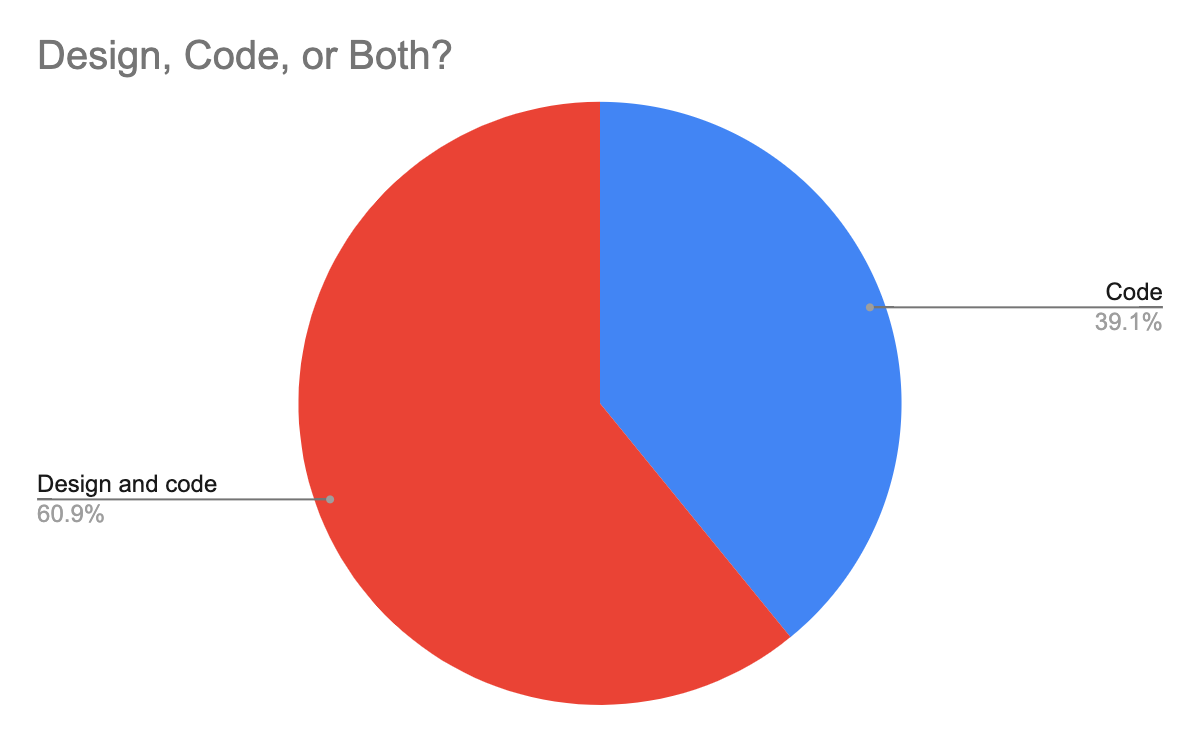
This was a screening question where the option "None of the above" (not shown) ended the survey.
2. How many hours during a typical week do you spend writing, reviewing, testing, or debugging code?
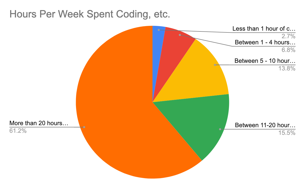
This was a screening question where the option "0 hours of coding" (not shown)
ended the survey.
3. How would you rate your overall satisfaction with the Web, as a platform and set of tools, to enable you to build what you need or want?

74.8% are satisfied or very satisfied, 25.2% are less than satisfied. This is
very close to the results from the 2019 MDN DNA
survey.
The purpose of this question was to contrast it to the following.
4. Based on your experience developing for the web, how satisfied or dissatisfied are you with browser compatibility?
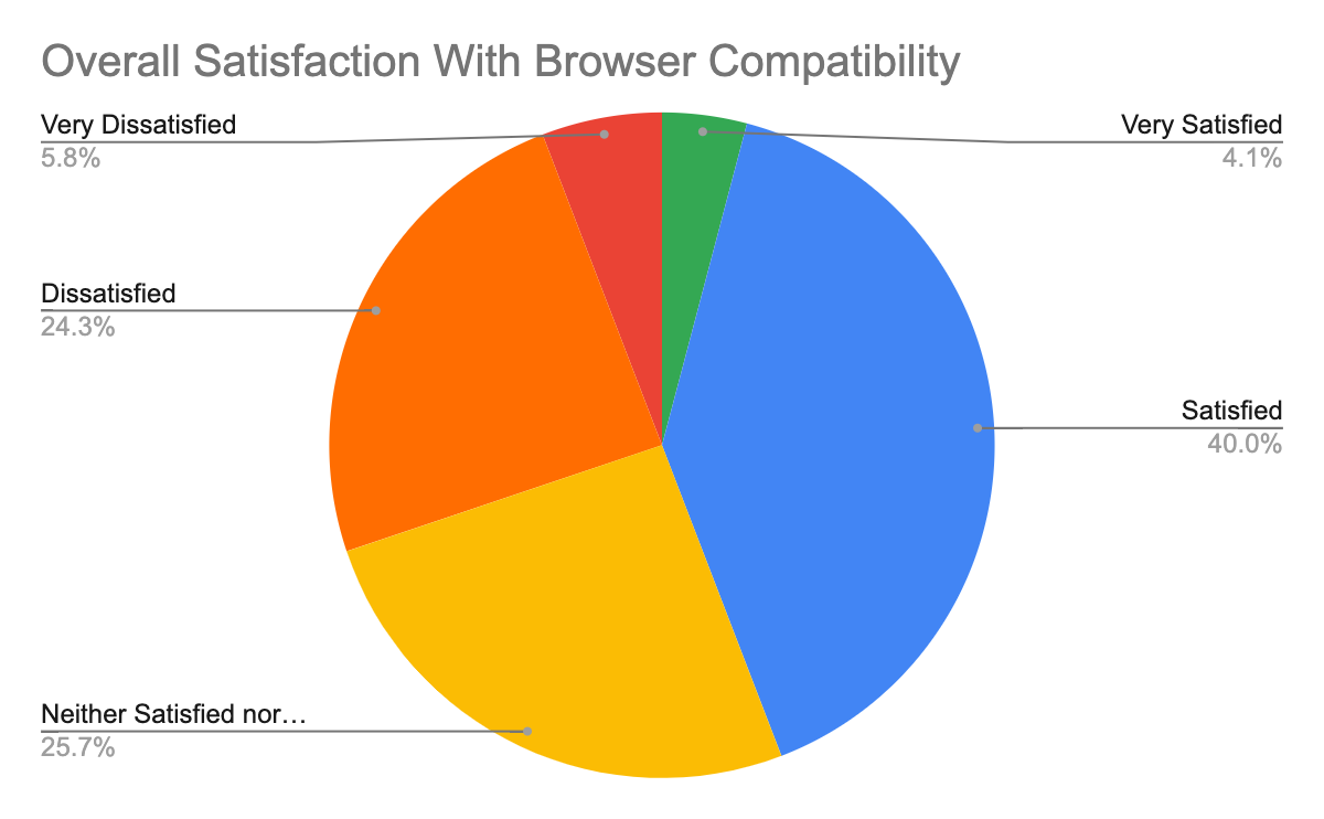 As expected, web developers are not at all satisfied with compat, with 30% being
dissatisfied or very dissatisfied, compared to 9% for the web overall in the
previous question.
As expected, web developers are not at all satisfied with compat, with 30% being
dissatisfied or very dissatisfied, compared to 9% for the web overall in the
previous question.
5. Overall, what is your top pain point with browser compatibility?
This was a free-form text question to capture what is top of mind for web developers. No limit could be placed on the number of issues mentioned, and the maximum number of categories assigned to a single response was 5. For the purpose of visualization, the 46 categories were merged into 12 groups, see the spreadsheet for details.
The most straightforward way to visualize the results is as the percentage of 1,429 valid responses that mentioned each of the groups:
With up to 5 categories per response, the sum exceeds 100%.
As described above, care was taken to identify a primary category for each response, allowing for a visualization of the single top pain point:
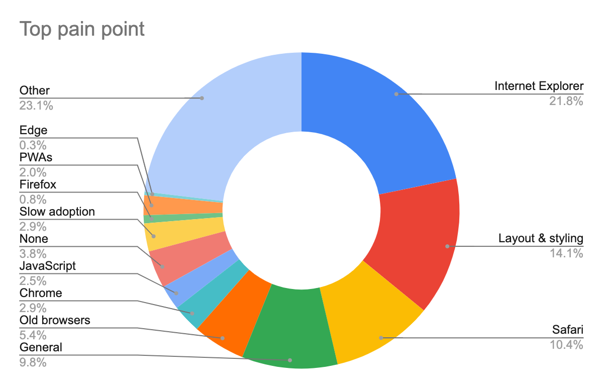
Notably, the order of pain points is roughly preserved. The large "other" slice
is the long tail of issues that didn't fit into any of these categories, each
occurring in ≤2.5% of responses.
6. What are the biggest pain points for you when it comes to browser compatibility?
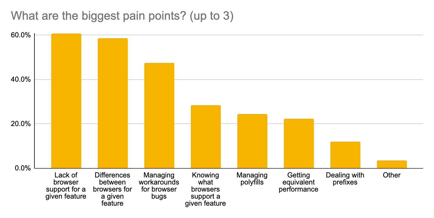
7. What feature areas cause the most issues with browser compatibility?
8. What layout or styling features cause the most issues with browser compatibility?
This question was only shown if "Layout and styling" was selected in question 7. In the following graph the total number of responses is 685.
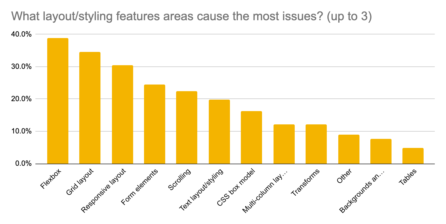
9. What browsers/platforms cause you the most issues with compatibility?
Appendix D: Survey Results Excluding IE
Because Internet Explorer was a top issue we suspected that the results around feature areas would be biased a lot towards what is a problem in IE. Also, IE will never change and will eventually become unsupported and unused, so it makes sense to ask how things would look if IE wasn't around. To get a sense for this, we look at the 415 responses that didn't mention IE in 5 or select it in question 9. This should be compared against the 1,429 responses in the main survey results.
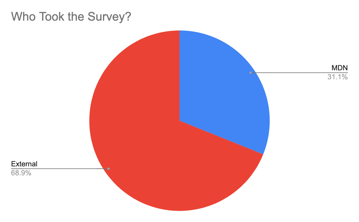
1. In regards to web applications or web pages do you:
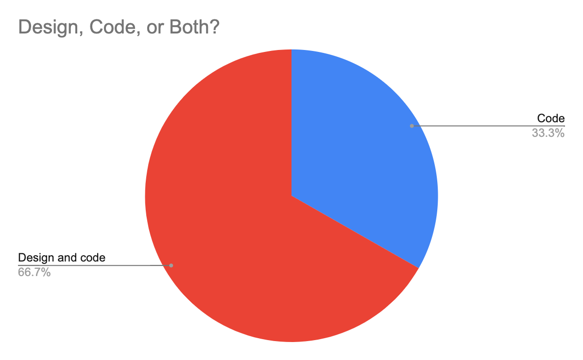
2. How many hours during a typical week do you spend writing, reviewing, testing, or debugging code?
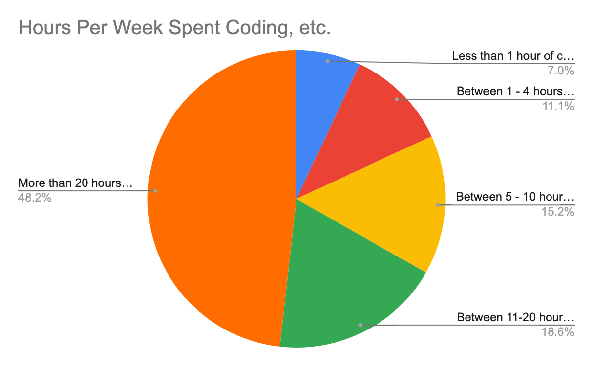
3. How would you rate your overall satisfaction with the Web, as a platform and set of tools, to enable you to build what you need or want?
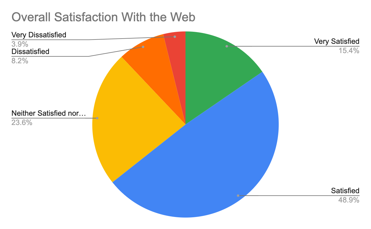
4. Based on your experience developing for the web, how satisfied or dissatisfied are you with browser compatibility?
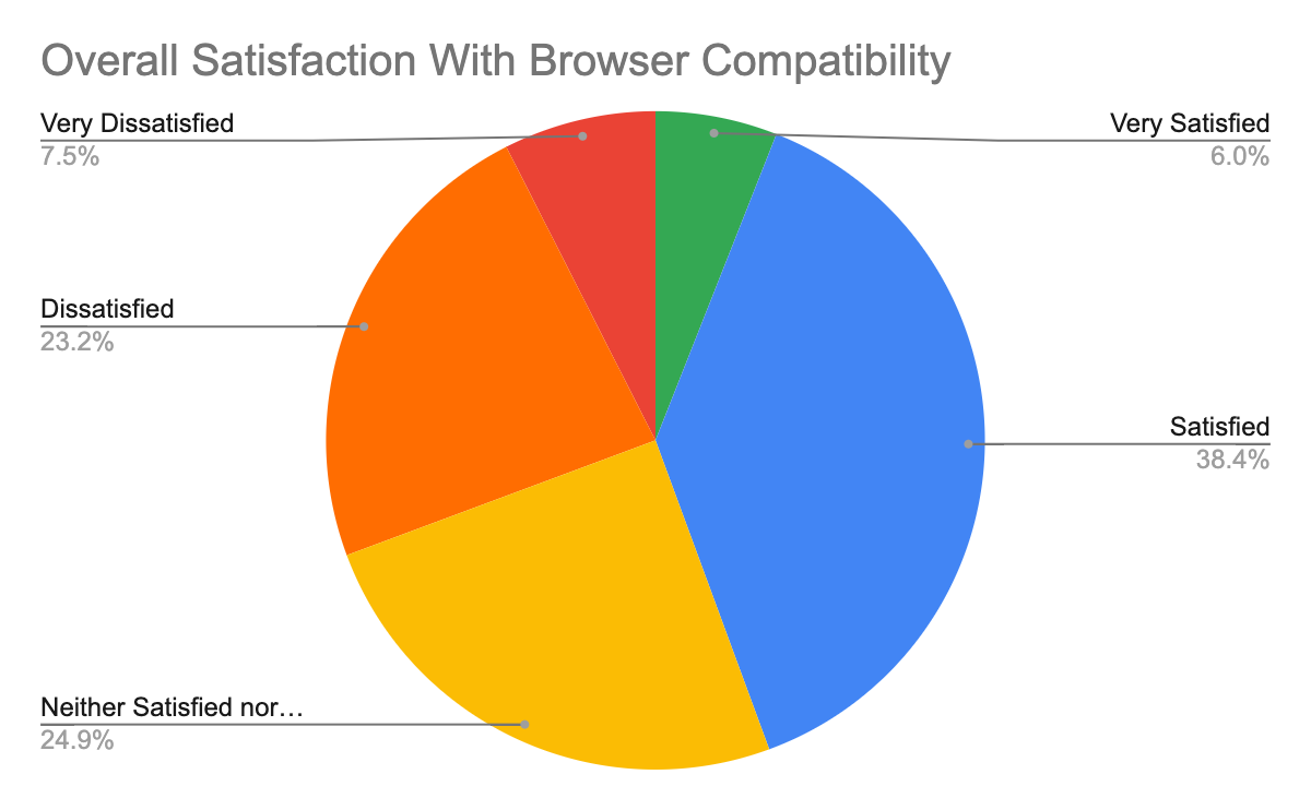
5. Overall, what is your top pain point with browser compatibility?
This was not analyzed in the "excluding IE" subset as it would have required extra effort due to how the results for this are structured in the spreadsheet.
6. What are the biggest pain points for you when it comes to browser compatibility?
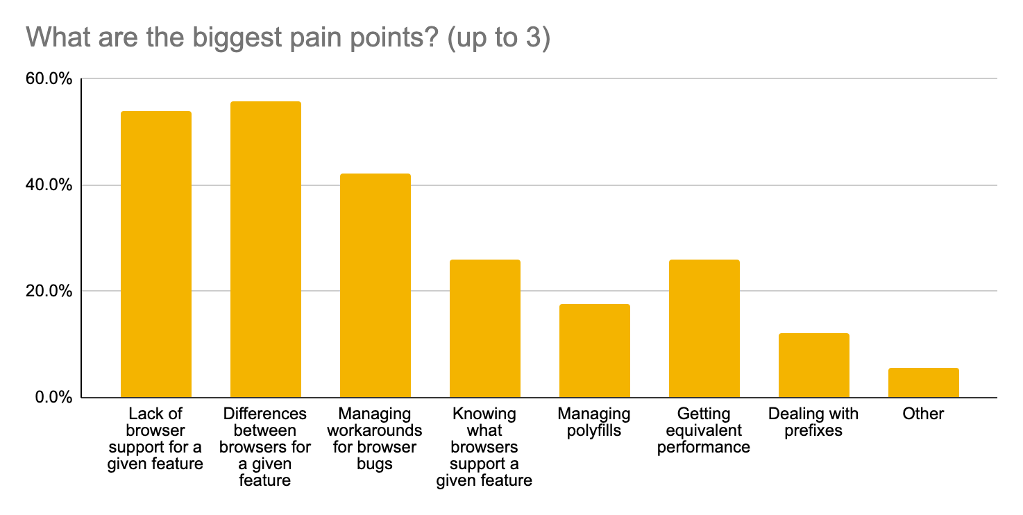
7. What feature areas cause the most issues with browser compatibility?
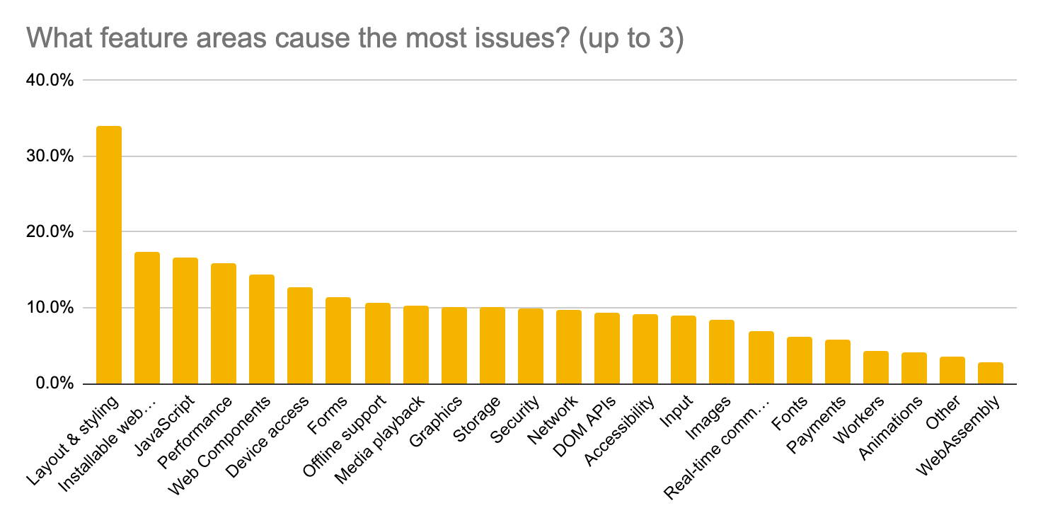
8. What layout or styling features cause the most issues with browser compatibility?
This question was only shown if "Layout and styling" was selected in question 7. In the following graph the total number of responses is 141, compared to 685 overall.
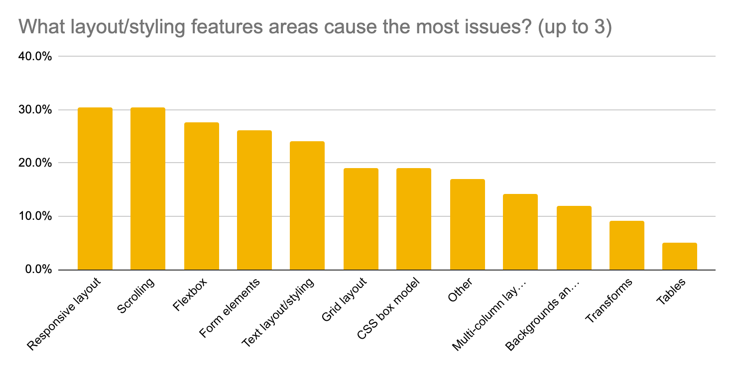
- 30% Responsive layout (up from #3)
30% Scrolling (up from #5)
These options were tied exactly at 43 responses.
- 28% Flexbox (down from #1)
- 26% Form elements (unchanged rank)
- 24% Text layout/styling (up from #6)
- 19% Grid layout (down from #2)
9. What browsers/platforms cause you the most issues with compatibility?
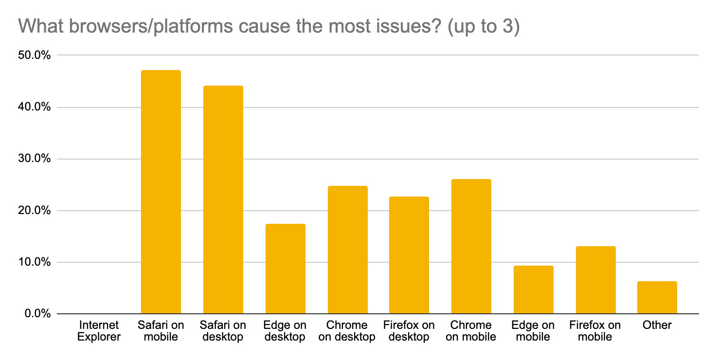
Appendix E: Interview Study
Study Goals
Our goals for the interview study were:
- Learn about a few concrete problems people have with responsive layout and
scrolling.
- Expectation: The clearest theme from the free-form survey response was dealing with the dynamic viewport size: viewport units, URL bar and virtual keyboard. Is that top of mind for everyone, or just those few who wrote about this?
- Understand the rough shape of compat pain around "JavaScript", which was
feature area #2 in the survey.
- Do people mean the JS language or DOM APIs or Web APIs?
- Is JS still a problem if you use tools like Babel?
- Should we work on tooling to work around the issues or work on the core JS language?
Deprioritized goals:
- For CSS Flexbox and Grid, does IE specifically cause most pain, or are these
problematic also in recent Chrome/Firefox/Safari?
- Expectation: They are problematic even when discounting IE, especially Flexbox.
- For IE and Safari, is the problem mostly missing features and bugs, or is it
the difficulty of testing these browsers?
- Expectation: IE is so different that great testing wouldn't help, but for Safari the inability to test without Apple hardware is a bigger part of the problem itself.
Discussion Guide
This is an abbreviated version of the discussion guide used for the interviews.
Introductory Questions
- Can you tell us a little bit about yourself?
- Hometown?
- Profession? What size/type of company?
- How long have you been programming?
- Can you tell us a bit about what kinds of websites or webapps you build?
- Desktop, mobile or both?
- Which browsers?
Browser compatibility
- JavaScript
- When was the last time you had a compat issue with JavaScript? How did you deal with it?
- [If they use tools like Babel, why is JS still a compat problem?]
- [If they don't, why not? What do they do instead?]
- Is any browser particularly problematic for JavaScript compat?
- Many people have said that JS core is a problem in our survey, can you think of why that might be?
- Responsive layout
- Do you build for both desktop and mobile? [If not already known.]
- Can you recall the last time you had trouble making a design work well on both desktop and mobile devices? What was it and what did you do?
- Scrolling
- [Possibly prompted from the previous topic, otherwise skip.]
- Scrolling is something that almost all websites and webapps need to do. Have you ever had difficulties getting scrolling to work as you wanted? How did you deal with it?
Browser compatibility (deprioritized section)
- Safari
- Do you support Safari?
- Are there missing features or bugs? Which features/bugs?
- To what extent are missing features in Safari an issue for PWAs?
- How do you test in Safari?
- If not at all, is it because you have no access to needed hardware?
- Do you support Safari?
- Internet Explorer
- Do you support IE?
- Why do you need to support IE? Why do your users still use IE?
- When was the last time you had to do something special to support IE? What did you do?
- When was the last time you couldn't use a feature because of IE? What did you do?
- Do you support IE?
- CSS Flexbox
- When was the last time you had a compat issue with CSS Flexbox? How did you deal with it?
- CSS Grid
- When was the last time you had a compat issue with CSS Grid? How did you deal with it?
Wrapping up
- The "magic wand question": If you had a magic wand and could change anything about the browser compatibility landscape, what would it be?
- Do you have any additional questions for us?
- Thank you!
Appendix F: Interview Transcripts
This appendix includes all of the transcribed content from the 13 interviews. Quotes from these transcripts are included elsewhere in the report, and these transcripts may provide additional context.
Some questions not in the discussion guide were prompted by things from the participants' survey responses.
Note that far from everything that each participant said was transcribed. In particular, if we asked about a topic and the participant didn't have much to say, it's not included. Note also that the questions aren't transcribed verbatim and sometimes left implicit.
Participant 1
Browser support
What is support based on? Usage? Something else?
The most we cater is Chrome, Safari, Firefox, and Edge. Our user base mostly… we have been working, you know, with corporate clients. They are mostly not allowed to install any additional software in their systems, so they really have to use the browsers that come with the operating system. So that's why we have to support Edge, mostly with people who are working on Windows machines. And also for students, there are a lot of students, you know, sometimes who are not that tech savvy and go with the default Safari browser in the Mac and are not really interested in installing Chrome. So we have to support Safari as it is the default browser of Mac. We have to support Chrome because most users on Windows are using that. Or Firefox. As I mentioned Edge is now the default browser on Windows machines, so there's a large user base there that is dependent on that as well. And our analytics [inaudible] show that these are the top 4-5 browsers that users are most using.
Internet Explorer
What about IE, do you have to support it?
Internet Explorer was used quite a bit by a lot of people when it was the default browser in Windows, but from what I know I think that Windows has now switched to Edge, so there is about 1% of our user base which still uses Internet Explorer, but the general consensus in the company between product and engineering is that we're not going to support that from now.
Safari / Scrolling
Trouble making a design work on desktop and mobile? What did you do?
The interesting one that, you know, we had to scratch our heads to find out what was really going on was… There is this thing I guess in iOS and Mac as well, that Apple adds a little custom scroll at the end of pages, on browsers. There's a special effect when you scroll to the end. That behavior was kind of disturbing us when one of our layouts that we had built for desktop and mobile both. So the scroll worked fine in Chrome in iOS, in Chrome and Safari on macOS. But in Safari for iOS there was somewhere where that scroll was interfering with our scroll. Sometimes, if you slide somewhere it would scroll and if you slide with a different angle or you slide very fast then the scroll wouldn't work directly. That was an issue where there was no solution or help on the internet, so we had to get creative and redesign some of the screen to get around this problem. I don't really know what that problem actually is, but most of the internet help we found was about Apple's custom scroll animation at the bottom interfering with the browser, or something like that.
Participant 2
Browser support / Internet Explorer
We officially support… I think our browserslist is pretty standard, last 2 major versions, not dead, >1%, market share, and we officially cut IE11. We were supporting that until we realized just how bad the site was in IE11, no one had ever tested it. We tested it and discovered that, in fact, most of it didn't work in IE, so we just decided to drop it. Most of our users are tech savvy, they're startups and they're using browsers that are not IE, so it's not our audience.
Part of our product team thought that we were supporting IE much more than we were. So it kind of just quietly happened where we were like: "so this is bad, and we're not going to worry about it."
I used to work at a company where I worked on internal apps for a large company, and our IT department enforced IE11 on all machines and that was the only browser we were allowed to use. So unfortunately my knowledge of IE11's issues is pretty large just because I had to support so much in IE11.
Unfortunately IE11, last I checked, is still at like 1.7% in the US which is just really sad, but hopefully someday it drops to a pretty low number.
Flexbox
Anything for IE in the last 4 years? Workaround?
All the Flexbox gotchas that IE has are pretty frustrating, and I'm intimately aware of many of them. This is actually the first time I've not had to support IE in my career, so it's pretty nice.
A lot of the flex issues were around height and flex-grow or flex-shrink. Just simple things like explicitly setting a height on the flex child would fix the issues. I think the other things are just things like IE doesn't do CSS variables. So if you want to do any reactivity with just CSS, it's not easy.
JavaScript
Fortunately it's pretty good these days. Like I said, we support pretty much the last two major versions of any major browser, so, JavaScript is in a state where it's pretty solid, I would say. We do use polyfills for things that are not supported and that's managed by our build system. We have the TypeScript compiler adding in its polyfills. A lot of that is just handled by our build system. I forget the technical term for them, but we are using the question marks before object property access, that's an explicit polyfill that we import in our project. But by and large I think most of the JavaScript we're using is pretty standard now, it's pretty well supported.
I used the DOM mutation API recently and that was well supported on all the browsers I tested. Things are fairly good now, it's not like the old days where there was a big gulf between browsers.
Web APIs
How about Web APIs?
For the most part they're pretty complete. I'd say the biggest issue is not so much the API itself not being implemented, but parts of API not being implemented in certain browsers. For "scroll to element", there's a "smooth" property that some browser's don't… I think it's Safari that doesn't support the smooth object property in the scroll to element API. We just added a polyfill for it, it's like 2 KB so it's not a big deal. Fortunately the build systems we have are pretty good at putting in a polyfill for what's not widely supported.
Responsive layout
Last time you had a problem between desktop and mobile?
We use a grid system from a project called Vuetify, which is part of the Vue ecosystem. It's based on the Bootstrap grid system. It's well tested, it's cross-browser, so fortunately we don't have to worry too much about layout issues. […] Just having a grid system that's well supported and tested by other parties is a super helpful tool.
No longer supporting IE, what kinds of benefits are you getting from a grid system?
It's something that we use in every component. Our design team is using a grid system in Zeplin and Figma, which are their tools. We actually did kind of a sprint to align with Zuchrids. [?] So now we have the Vuetify grid system using the same breakpoints and columns, gutters and things like that as the design team is using. Having those in sync now makes our development so much easier, and it makes us not have to worry about "are these columns lining up correct" or "are they collapsing when they should?"
Any other browser than IE a problem for Flexbox/Grid?
I would say Safari is the other wildcard, just because they've sort of implemented their own… a lot of their own technologies, and they've implemented standards with slight variations on behavior from Firefox and Chrome, which seem to be kind of on the same page with a lot of layout. Safari is kind of a wildcard, most of it is OK, but occasionally I do run into Flexbox quirks with Safari. Usually a simple CSS rule will fix it, but sometimes it's a little more difficult.
Do you remember the last time?
I don't. I want to say it was probably SVG related, just because SVGs are so complicated and the way that we size them can be difficult. Probably an SVG issue I would say. Can't quite remember though. If there is a chance of an issue with layout it's usually Safari that we're worried about.
Probably having to do with SVG aspect ratio or scaling SVGs or something like that. But I don't remember.
Scrolling
Aside from the smooth scrolling issue, any other issues?
I've encountered a scroll issue in Firefox on iOS where there's something about the way that Safari is embedded in the iOS app that messes up scroll position sometimes. Because I think that Safari embedded is calculating internal values based on what it thinks is the viewport, and the app is actually wrapped in a smaller viewport because of the UI controls. That's my guess. So the scroll is a little bit off and I have to scroll with two fingers sometimes to get it to like jump out of the containing window. But I think that's the only thing that I've seen.
Safari
You mentioned you support Safari. Any features or bugs, anything that's missing? Run into anything recently, "wish they had that?"
I think the scroll support is something that would be great if it were cross-platform, cross-browser. […] Fortunately most of our layout issues have been resolved with the grid system that we're using. Occasionally we use a Web API that's a little arcane, like DOM MutationObserver for example, but I think that has such good browser support that it's pretty good. I think Safari is just a wildcard because its development exists sort of outside the rest of the other browsers. So there's so much support behind WebKit, but Safari sort of does their own thing. It's kind of always a guessing game as to what they've implemented and what new standards they've decided… It seems like they're a little more selective about what they implement and don't implement all standards completely. Much like IE used to do.
Think back to Safari issues, more missing or implemented by different/inconsistent?
Like I said it's sort of a guessing game as to what Safari has implemented of a standard. Sometimes they implement things that are not standards and they sort of create a de-facto standard. But I've been doing web development since I was a teenager. In those days things were a lot worse [inaudible] browser support. I feel like this is kind of a golden era for being a web developer just because there's so many standards that have been agreed upon and implemented widely. It's mostly small API details here and there that you have to work around and dig deep to fix.
Participant 3
Browser support
Usually the baseline is IE11. It's still a thing. For the startup I mentioned, the clients are mostly from the banking industry and large corporations. Some strange IT policies where they still rely on IE11 internally. Apart from that, yeah, the typical. I would say it's more about engines than browsers nowadays. It's Gecko and Blink of course, and WebKit. But WebKit is, um, especially… so on mobile we don't test on Android most of the time because we don't have a device lab at hand, so we just hope for the best to be honest. Because I have iOS devices I don't want to buy additional things that are just catching dust all the time, and spend a couple of hundred bucks or maybe ever more just to get a decent range of Android devices.
You mentioned you don't have Android devices on hand, do you do something else to figure out if it will work?
We usually rely on… as it's Blink working behind the scenes, we mostly rely on that. Especially on smaller projects it's mostly an issue of timing and budget, so I use what I have at hand. I can also run a simulator on my computer. It's been a while since I did this with an Android simulator, but I remember that the performance was very bad, and was not nearly giving me a real expectation of what it's like to use a website on a real device. Maybe I can get hold of an old Android phone someday, but then we still have the problem that I probably can't run a current version of the operating system.
I've tried BrowserStack, but haven't been convinced I'd use it often enough to justify a subscription. If I had a project that was more mobile focused where it really was a key requirement that it runs on Android without any hiccups, then I would probably test. Especially if it's something that's important information for people, like say it's information on Covid-19 or something like that. If I worked on things like that I would probably give much more attention to that. At the moment, it's not that I wouldn't care about Android, it's just a matter of what's practical.
Scrolling
Any recent trouble making a design work on desktop and mobile, essentially responsive layout problems?
We have to support IE11 and Grid support is limited. This often requires heavy workarounds, so you always have to do a lot of things with the help of additional JavaScript that you wouldn't need to do otherwise.
What gives me the most headaches, typically, is scrolling behavior of iOS, so, if I need to display a modal or something like a typical hamburger menu. And still annoys me that I need a JavaScript library just to get this right, so that if I get a modal, that the background doesn't scroll on iOS. I think that's basically the worst issue that you stumble across in almost every project.
Is the issue bouncing at the end?
Yes. The goal is always that you lock scrolling completely. There's a good library for that, it's not even large, it's a small JavaScript dependency. But it annoys me that you need these workarounds for doing simple stuff like that. And while keeping support for desktop browsers, at the same time.
(The library was later confirmed to be body-scroll-lock.)
Safari
For Safari, you mentioned scrolling. Anything else?
In our CMS we have input fields using CodeMirror. We are still waiting for version 6, I really hope it comes out this year. Because with iOS 13 there have been a lot of changes, under the hood, probably. Because cursor placement, copying and pasting inside of CodeMirror no longer works reliably. Text selection is broken. I don't know if it's a CSS issue on our side, but my guess is it's mostly related to something in iOS that's changed.
Also annoying, let me give you an example for another project. We were using a pretty popular JavaScript carousel called Glide.js. With iOS 13 they changed something and now scrolling works like garbage on iOS, especially on older devices such as an iPhone SE or older iPads. All the animations are broken and it doesn't feel natural if you're swiping through this gallery. Now I've used this in 5 or 6 projects, and something that used to work fine is now broken.
You mentioned scrolling, you mean going from one card to the next? Can you talk more about what broke?
Suddenly the animation didn't… if I start swiping on the other surface, then the current slide just starts to follow my finger, but not in a natural way like you would expect from native iOS component. A lot of sliders don't replicate the iOS behavior. This time, you just slide, and once you reach a point where it should move on to the next slide, it just flashes and the next slide is there. There's no smooth transition. It's probably mostly a memory issue or performance issue. But it's just annoying to see that something used to work and doesn't work any longer.
I got this on websites that are mostly about displaying large photos. How annoying is that, if it doesn't work anymore? After you build it for a client and it used to work fine.
What about CodeMirror?
We decided to wait for CodeMirror 6, because it's built with mobile support in mind and most of the content editing in the CMS currently still happens on desktop, I guess. Yeah, it's not nice.
I do a lot of text editing with my iPad, usually there's a keyboard attached to it. It would be much nicer if it would work like it's supposed to.
Flexbox / Grid
Any recent desktop issues?
Just a week ago, we also had another carousel, and all the slides should have the same height. The height should be dependent on the highest slide. So Flexbox, and Flexbox, another Flexbox, all nested inside each other. We didn't start from scratch, obviously, we just used a slider component that was already there. The slider component is not the issue here, in this case. Flexbox had differences between Firefox and WebKit- or Blink-based browsers. We couldn't achieve these equal height slides on anything but Gecko. In Gecko it worked fine, in all other browsers it did not, so we also needed to have a JavaScript solution here. In this case doing layout calculations in JavaScript is never clean, it always feels a bit dirty, but in this case the slider's based on JavaScript anyway. So OK, we made this tradeoff.
Did you find out what the specific difference was?
No. The way Glide.js works is you get a container where all the slides are stored in and this one uses Flexbox for display values, as far as I know. You should usually be able to give each slide the same height, but it didn't work in anything but Firefox. Don't know why.
So Flexbox, maybe, so, from the things that bug me the most. Mostly little differences in Flexbox implementation. Of course we have to support IE11, but even in other browsers you see a lot of differences. This is something you face almost on a daily basis. You know your way around it, especially with IE11 after a while. But I think there are still some bugs that remain, even in modern browsers.
How do you generally work around differences that IE11 doesn't support modern things?
It really depends on the design, on the client. For this one startup, because of a lot of clients from the bank industry, think they had 7-8% IE11 users. We did everything in the most painful way, built everything to work exactly in every browser. With the latest relaunch of the site we finally switched to let's call it "graceful degradation" or "progressive enhancement", that's how we handle it now. If something's too complicated to get it built in IE11 with Flexbox, then we had compositions of images that were dynamic and responsive and stuff like that. We used to build everything pixel perfect, now we don't do it anymore.
How about CSS Grid?
Simple grids work in IE11 as well, it's often much easier to do things even without having all the latest grid features available. For other projects I'm starting to transition to grid layout. I wouldn't say I use it 100%, Flexbox also has its use cases. I think back then I avoided using Grid, I still try to get around it especially with older devices in mind.
A lot of people in my family actually still use an iPhone 4S. I know a lot of non-technical people who just don't care and I think it's fine. Those people shouldn't be left behind. It's not IE11. Maybe IE11 even holds back the web a bit in terms of what features are used. I think a lot of older smartphones maybe also profited from that, you know, because they're no longer supported and get software updates. I'm a bit afraid this will change now that IE11 is about to die.
Participant 4
Browser support
Usually I tend to work on Chrome, because for me it's like most dominant browser on mobile phone and also on computer. Also it's always on top regarding the different APIs, it always has the last. So I tend to focus on this browser. If something doesn't work I look at Mozilla to see how it works in their browser. So I have at least those two working together. For me I guess it's enough. I'm concerned about compatibility but l'm looking at where the most users are and I tend to focus on these points.
How about Safari on desktop or mobile?
Safari is almost like Chrome, but I don't like these browser vendor prefixes. So if the Chrome API works in Safari it goes fine, otherwise I will not test it, so I will never know if there's a bug happening.
PWAs
What was the last issue you had with vendor prefixes?
It's been a long time. Now my biggest issue is when you try to make a progressive web app manifest, it's different for each [browser], so it's a bit… repetitive task to create multiple manifests for different browsers.
Different browsers required different things?
Different sizes of logos, different information, different scopes. That was enough, like "OK." Some frameworks tend to automate it, but I didn't event… now I'm already focused on the JavaScript part, trying to work offline, looking for a project where I can include web workers in a very efficient way, so for now I'm not really focused on the manifest anymore. But it's a point I wanted to discuss, because I think it's [inaudible] if you want to make [inaudible] to progressive web apps, it's good to have a manifest that's easy to build for any developer.
JavaScript
You work with vanilla JS, any recent compat issue?
No, because by working with different teams, they all like React a lot, and they like the build system that is Webpack, which fix the different compatibility issues.
On the JS side, do you use the latest JS features?
Yes, exactly, and I include Webpack in my build. I used to work with full JavaScript but having Webpack to fix different compatibility issues is less work done for better work done.
Internet Explorer
Do you support IE?
No, not at all. I tend to program next generation apps, or I try to. If you are looking for a next generation experience you can not find it in an old browser, so I don't focus on Internet Explorer, because for me it's old and old browsers don't want new experiences.
Did any client require it?
Some teams I've joined, yes. But they had a build system ready so I didn't have to build for Internet Explorer.
Testing
When you ship new features or a project, what does the testing look like?
I tend to do direct testing by myself, because to automate those kinds of tests is pretty difficult. I prefer to work with websockets, so I find that just to program the test for websocket means I have to add some delays and change different things. So I prefer to test, and sometimes I try directly in the console. I just keep adding pieces until it's complete.
Participant 5
Compat issues
Last time you used Web APIs and had compat issues?
In a personal project I'm using Web Share API and Preload. When I share my URL with Web Share API in Chrome the platform just handles it, we can share with Twitter, with WhatsApp, with Telegram, or with anything. And then when I tested with Safari it just worked. But in Firefox it doesn't. Also, for preload, it works on Chrome and Safari, but in Firefox it doesn't yet. In this case, for preload, I just used the stylesheet for that because I'm preloading CSS.
What did you do?
So just give the user "sorry, it doesn't work with Firefox, try another browser." And I think I'm using a second one, the user can copy the URL and paste into another platform, Twitter or anything. I want the platform to handle this instead of the web developer.
Magic wand question
I would like that Web APIs are supported in 3 different engines like Chrome, Safari and Firefox. Usually I see that Chrome is too fast when they ship web APIs in their browser. Firefox and Safari, I don't know their direction, but I think they are full of consideration, but it takes a long time maybe until… I just wish that for example if Web Share API is supported on Chrome this month, then maybe 1 month later Firefox supports it and 3 months later Safari supports it. I wish that, because it's trouble for us. These APIs are cool, and we are using them, we want the platform to handle this, we don't want to do extra work to handle this, we want the platform to just handle it. I don't know what exactly happened between Chrome, Firefox and Safari when Web APIs land in one of the three browsers like that.
Participant 6
JavaScript
There was a difference between Firefox and Chrome when it came to CORS. This was back in either November or early December. This actually relates to CesiumJS, using an ion service. What they do is they offer tilesets and terrain that you can grab from their server and render it with their CesiumJS platform. That's all fine and dandy, but something in one of the Firefox updates just completely broke the CORS, or rather the CORS broke the program. Even though running on the website (not localhost or anything) and even though it should have been sending the proper origin. Because I looked in the headers, and it was sending the origin and sending accept headers, but for some reason the options we received in the response didn't actually work in Firefox. It was sending the… wasn't like HEAD… I forget the term for it, but it was reaching out to the server asking for CORS and then it was saying "nope, can't do this." And it was doing this for every single tile that came from Cesium ion servers.
This was on Firefox and I thought that was just broken with Cesium. I was about to submit a bug report, open up an issue, but I checked it out on Chrome and it worked just fine. So I looked into it a little bit more and it was something to do with the strict syntax, I think that Firefox had a little more strictness to it when it was looking for CORS information. And Chrome seemed to be fine, like it didn't really care one way or the other if this was sent first, or if this was in a certain case, as long as it received the information it was fine with that. Whereas Firefox was freaking out about either order or like literally either uppercase or lowercase. I don't know what actually did it, but about a month after that started happening Firefox had resolved the issue, but that's just one example.
Safari
Do any incompatibilities come to mind?
I've noticed that the fonts, for some reason, don't really render correctly. I'll have a font that was stock issue from one of those… it wasn't Typekit and it wasn't Google Fonts, I forget what the CDN was. It was a relatively old but stable font, that we could include anywhere. I noticed that even though we had the margin right, the padding right, the kerning right, everything was just spot on, the display of it on Safari didn't look right, it was like the width of the characters, even though it was in the same style, it didn't have the correct width, or thickness rather, for the letter strokes. We kind of had to throw our hands up and say "well, this is just going to look a little bit weird on Safari." So that was an unfortunate thing.
I've noticed some other CSS-related issues. I can't think of one off-hand, but it was either something about vw or vh for the viewport width and height. Or percentages for widths and heights. It was some irregularity with that, and although it was perfect on Chrome and Firefox, it just did not look correct on Safari. We still support it, because it still works with the dashboard that we've been building, but some of the things don't just quite look right. You know, it's little cosmetic things, it's fine, it's just not perfect.
Performance
Since we're doing a lot of WebGL stuff we have to recommend that everyone that uses our website uses Firefox, because it is just not performant on Chrome, sorry. I guess it works, it's just you can't really get up to 60 frames per second, especially with a lot of entities and assets being deployed. I don't know if it's specifically CesiumJS or if it's my code, I haven't done a strict A/B testing. We've just seen that Firefox seems to be a lot more performant. So we definitely recommend Firefox over Chrome, but Chrome works and, you know, a lot of people use it so we don't really say "don't use it," we just, if we have a chance we recommend Firefox. For this specifically, for the algorithms we have to run and for WebGL, I think some of it is also WebAssembly with CesiumJS specifically, some of the workers to load in textures, those are a lot more performant on Firefox for some reason.
Magic wand question
Would be great if Firefox would take some of the best things from Chrome DevTools. With WebGL we see a lot of errors, but in Firefox just see a warning or error and no trace. Chrome gives a trace, and the debugger is amazing. Instant/eager evaluation in Chrome was great, happy that Firefox is doing something similar now.
Participant 7
JavaScript
Thank god now we have transpilers which do the dirty job for you. Just because I told you I still need to make something for Internet Explorer, the two latest versions of Angular have started avoiding being compatible with Internet Explorer by default. They have Angular 8 and 9 default settings which avoids transpile for Explorer. So when I attempted to upgrade an application from 7 to 8 I found out that nothing was working with Internet Explorer. I found out why. But generally transpilers help me much.
Lately not much concern with JavaScript/ECMAScript/TypeScript compatibility because we have very, very good polyfills and transpilers, so there is not much concern about ECMAScript.
Forms
Encountered any incompatibility issues recently, when it comes to forms?
Not in logic, but in the layout. It's always been a pain for me making decent layout among all the browsers, or better, among all new and legacy browser. Because with Firefox and Chrome there is not much trouble in hiding the generic selectors, default selector, etc., But when it's time to do the same on Internet Explorer […] it's still a pain. And there are some other things which I would like to be implemented, like styling the scrollbars, or whatever. The scrollbar would be appreciated. Styling the scrollbar, just like in Chrome.
Edge / Internet Explorer
I hope that Microsoft will roll out the new Edge as soon as possible. I never thought much of Edge even in older versions, because it has always been mostly compatible. It still had some troubles like in the placeholder CSS pseudo selector, but nothing particularly hard to solve. Anyway, I hope that Microsoft will soon release the Chromium version, or roll out the Chromium version on Windows update, and the world will be better.
You mentioned a selector issue in old versions of IE. How did you work around that, the last time it came up?
I don't remember whether it was on Edge or Internet Explorer, but there is a selector which says if you have a placeholder in a form input is shown or not. In that case, I wanted to remove the label when it was not shown, in order to make a cool-to-see input field. But it could not work in Internet Explorer and I wanted a CSS-only solution. I had to make a different layout, because there was no other CSS-only solution to make it backwards compatible with Explorer.
Note: This was about the ::placeholder pseudo-element.
Safari
You mentioned you want to stick to things that also work in older browsers. How do you find out what works and doesn't work?
Testing, just testing. I would like to say that when Explorer will definitely die, my new concern will be Safari on macOS, rather than iOS. Because I also hate that browser, because I often found many bugs.
Last time, or a big one?
The biggest one who made me angry in the past was that in Safari, don't remember if only mobile, but if you have a fixed bar which moves rather than animates, and you scroll down, the bar is not refreshed until you stop scrolling. It's refreshed just only when you stop scrolling. So you have to find some workarounds in order to force Safari to refresh the layout of the scrollbar, or whatever is fixed on the screen.
Responsive layout
Recent issues?
Not using the most used platforms. But my colleagues asked me for support for a newly made application in another team. It was due to a bug in Bootstrap 3. There was a box which went on a new line in only iOS, just today. It was a bug on the grid of Bootstrap 3, which was fixed in Bootstrap 4.
Magic wand question
For my current job, I would work on styling the forms. Just today I was trying to inject a background in a <select> box, in the options I had some car brand's names and wanted to set a background with the logo of the brand. I could not do that, if not using a wrapper, a fake <option>, because it cannot be done in an <option>. I think there's space for evolving the layout for the forms, select boxes, input and scrollbars on Firefox.
Participant 8
Browser support
When you build things on the web, what browsers do you typically support. Do you have a typical set, or is that defined by your customers, how does that work?
It depends. If there is already an audience and already data for that audience, then we try to see what browsers are used. It's always good if you can drop Internet Explorer of course, but it's not always the case. That's it. It depends on the target audience. If it's for a broad audience then we look at the countries that are concerned by the project and start based on this. Sometimes, also, the project doesn't have to support Internet Explorer but the client typically uses it, is blocked on Internet Explorer, so we still have to support it to smooth the communication with the client.
Internet Explorer
Last IE11 problem, do you remember what it was and what you did?
I think it was a missing polyfill, a JavaScript polyfill, but I don't remember the feature exactly. Something around Object.entries() or something like that, I'm not sure. I don't remember the exact problem, but I quickly noticed that it was something around JavaScript, so I just opened the IE devtools, saw the error and understood a polyfill was needed. That was a polyfill available in the core-js library, which is a library that has a lot of polyfills for modern JavaScript features, ES6 and more, and you can cherry-pick the feature you want so that you don't have to import a full library of polyfills, just import the one you need.
Filing bugs
(Regarding a position:sticky issue not transcribed.) By any chance, did you file a bug for this, or find a bug?
No, no no no, no. I didn't. Usually, I'm a bit discouraged about filing bugs, because it's not clear how to properly do that, and where, whether it's on Chrome or Firefox or Safari. I think the process isn't well explained and I personally have a hard time to understand what is to correctly fill out a bug, while I regularly do this on GitHub for example. That's it. Usually when I have this kind of issue I never go into the process of filing a bug for browsers. When you see a discussion about a CSS spec that is ongoing, sometimes I'm interested, but the discussion seems like you have to consider a lot of things to participate in these discussions. Even by giving your "I will be a user of this CSS feature in the future", even that I'm not sure… it doesn't seem to be very welcoming to non-spec-writer views. But maybe it's just me, the way I feel about it, not sure.
Participant 9
Background
I've been doing this for a while, I started web development back in the IE6 days, like around 2006 or -7. I know this focuses on browser compatibility, but… Back then browser compatibility was non-existent. I have some battle scars, I still have nightmares trying to get PNGs to work in IE6. The trauma.
Browser support
Basically all the evergreen ones and… I think it's Edge 15 and up, according to our research. Enterprise is a bit heavier on Internet Explorer usage but we just decided it wasn't worth it and we'll just ask them to use something more standards compliant.
Mobile browsers?
Basically Chrome, iOS Safari. We've been going back and forth on the iOS numbers, but we're targeting Safari from iOS 12 and up. It seems in general, at least from our research that iOS users are pretty good about staying on a fairly recent iOS version. And Android browsers… we haven't done a lot of testing on Android but we've tested in Chrome for Android. Since that gets updates pretty frequently we haven't really had any problems there either.
Viewport / Scrolling
The responsive layout you're using, do you remember when you implemented that, any browser compat issues that stand out?
A few things, yeah. Sticky headers, in some browsers position:sticky isn't quite so well supported. Then there's the odd viewport sizing in iOS that was a little bit of an annoyance. I kind of read the whole, long bug tracker thread in the WebKit forum about why they decided to size the viewport units the way they did. And it makes sense, I understand the logic, but we did have to figure out a few workarounds for a couple of our screens.
On iOS, as I'm sure you know, as you're scrolling the address bar will collapse. The viewport size is calculated based on the collapsed size of the header. If you want, say a full page screen, that fills the screen but no more, then you can't use viewport units. There is some webkit-specific stuff baked into Safari that we ended up using that will avoid that problem. But that was one of our initial stumbling blocks when we were trying to have a full-screen, non-scrollable view in mobile Safari.
We use -webkit-fill-available to handle that. That was the primary fix we found for the 100vh size issue in mobile Safari.
Does Chrome do it differently?
Honestly I can't remember if we had the same issue on Chrome for mobile. I know on iOS it uses the internal WebKit, so it probably just worked from that same property.
You mentioned position:sticky, what did you do?
The problem was actually in Edge. We had a stack of fullscreen videos that would stick as you scroll. On Edge there was a crazy amount of flickering as we were scrolling. We actually never quite fully resolved that. We made it a little bit better by drawing the videos, the background videos, to a canvas element instead of playing the video directly, which helped a little bit. But we honestly, it was something we just didn't have the time to figure out, and given the percentage of people who use Edge, we just decided it was acceptable.
Other scrolling issues?
We haven't released it yet, but there's a new homepage for our brand that I was building out. It had some fancy parallax effects and stuff. It was weird because on iOS on an iPad – it worked fine on mobile – but on iPad everything was really janky. It turned out after I had chatted with one of the senior engineers from the design firm that was helping us out, that iOS has performance issues when trying to animate an element that has text shadow. Once I removed the text shadow then things were smooth on the iPad again, which was kind of an oddly annoying thing to fix. I just darkened the background of the videos a little bit and then it looked OK. That was something I did not know, I had no idea that text shadow could cause issues like that on an iPad.
I had mentioned the issue of rendering video to a canvas. It seems that iOS was a bit more stringent about how much memory a canvas can use. We ran into some flickering issues on a… I think it was an iPad Pro, an older 12-inch iPad Pro. Because it's such a large canvas running at a very high resolution, sometimes the edges would clip as you would scroll. The way we fixed it is we ended up having just two separate canvases drawing the same video, and that stopped the flickering. I guess an individual canvas in iOS is limited to a certain resolution. Yeah, it was an odd thing that I kind of stumbled into.
Safari
Speaking of Safari. Features you wanted but couldn't use?
I was really hoping Safari would support offscreen canvas, but it does not yet. Offscreen canvas in Chrome or Mozilla, you could do your drawing and compositing off-thread and it really bummed me out that we couldn't do that because Safari doesn't support that yet.
I just tried to optimize the canvas drawing as much as I could. I basically created a canvas that wasn't attached to the DOM. I would do the drawing calls there, then, once everything was after composited and layered properly, then I would draw it onto the real canvas.
Chrome
The other thing with some of these background videos is they had clipped angles to them, the videos would have a clipped shape. We ran into clip-path issues. My initial implementation used clip-path, and the problem that I had with clip-path was that, for whatever reason, on Chrome, it was a little jankier than the rest. Maybe clip-path wasn't optimized for constantly changing content like a video background, and so the scrolling would kind of flicker and lag at the edges. Similar to Edge, but a different effect. I ended up using canvas to basically… I used the canvas blend modes to kind of do some compositing to clip out the shapes that we needed.
Scrolling
Anything else recently on scrolling?
You know how the iPad Pros have that nice, fast 120Hz screen? requestAnimationFrame will max out at 60fps even on the iPad Pro. You have to be really obsessive to notice it, like I am, but I did notice that when you're scrolling, certain elements would not… the transitions were not as smooth than the screen was scrolling, because they were running at 60fps, while the page scroll itself was running at 120fps. Most people wouldn't notice, but it did bug the hell out of me. It is an open bug, I did see an open bug on WebKit forums, so maybe that will come at some point.
JavaScript
With Babel and preset-env available, it kind of polyfills things that aren't there, so I didn't notice anything. I'm very grateful that the Babel team has made those types of incompatibilities a worry of the past, because everything gets polyfilled automatically.
Web APIs
I did notice an inconsistency, and I'm not sure what the spec should be. As I mentioned before, I was doing video compositing using the canvas blend modes. I noticed that what I had layered various images or shapes with blend modes, the behavior was different between Firefox and Chrome & Safari. My gut feeling is Firefox probably sticks closer to the standard and that Chrome probably inherited WebKit's quirks in that area. But there were some differences in the way that the canvas blend modes were composited between Chrome and Safari and Firefox.
What did you do?
I just tried a different combination of blend modes to achieve the same effect, I changed the ordering a little bit until they all looked the same. Trial and error, basically. Like I said, I haven't read the spec, and it sounds like very dry reading… I didn't really see which one was correct. For my purposes it didn't really matter, as long as they all look the same.
Performance
Cases of inconsistent performance?
I did notice that scroll events are fired differently in Safari vs. everyone else. Safari would… I took a few stabs at this and in the first stab, Safari would only fire the scroll event after the scroll had finished. So I ended up… the workaround I used for that was to just use touchmove and just call the same… Basically I had a render loop running, in a requestAnimationFrame loop, and I would update things in the touchmove event in addition to the standard scroll on Safari. That was one issue I came across.
Magic wand question
That is a tough question! I think ideally, everyone should just follow whatever the standard is. But the problem is, sometimes, the standard isn't… you know, standards change, and it doesn't specify every single detail, which, you know, that makes sense, it's almost impossible to do that. But if every single rendering, regardless of platform, would follow the standard as closely as possible, that would be a beautiful world.
Participant 10
JavaScript
Do remember the last time you ran into an interoperability problem with JavaScript?
Probably yesterday. Because we are supporting Internet Explorer 11, it limits the amount of modern JavaScript we can use. We relied on jQuery for many years, and it's still in our main codebase. It's only been a few months that I've been switching to write everything new in vanilla JavaScript. We haven't refactored it out of our site, but we're removing things, like, we don't, we just got rid of Modernizr, and we had a text truncation plugin called dot-dot-dot that I just coded a replacement for this week. So that'll drop later this month. So we're making strides to reduce the amount of code that we have to send the browsers. So I'm dealing with new things that are "old hat" for most people, but I didn't realize that if you have an element and use classList.add(), you can't add two classes at the same time in Internet Explorer 11. So I ran into that recently, I said "Why isn't this class showing? Well, it's because it doesn't support multiple classes at the same time."
Did others support that OK?
Yeah, and I haven't done anything with ES6 at all, I'm just trying to get going with vanilla JavaScript that's going to work in IE. I haven't found it incredibly difficult, but some people on our team do often use ES6 and transpile it for older browsers. And that's fine, but so far it's only been on these isolated projects and tools that are maybe on one page of the site. But the overall site, thousands and thousands of pages, I just don't feel comfortable changing the process from using the file that runs. We could build it into our build script that compiles… like we have Sass for CSS and it compiles and builds the code and pushes it to the server. But we just haven't prioritized that.
Unfortunately, we had a problem with the recording of this interview after the first topic, and couldn't transcribe the rest. We did take notes, however, so the feedback was not lost and is included in aggregate numbers elsewhere in this report.
Participant 11
JavaScript
Recent JavaScript issues?
One is the double clicking on a touch screen, like a surface laptop or a cellphone or a tablet. Specifically the surface laptop is a very interesting case because it shows people that you can have touch screen and mouse input at the same time. This is something that I looked really hard on the W3C standards and didn't find an answer to, which is, when does the dblclick event fire? No one knows, it's not specified. And interestingly enough some browsers, on the same platform, do fire dblclick when you tap twice on a touch screen. […] Some platforms, when you double tap the screen on the same point, it will fire a dblclick event in JS. Some other platforms will not, on the same hardware with the same code. That was hell because the problem with this is there is no feature detection for that case. I cannot automate that case, I can't have a test grid with a rubber finger hitting the screen with different browsers. I can't Selenium that shit.
What happened in the other browsers?
They just don't fire the dblclick event. You have 2 pointer events. You have one pointerdown event followed by a pointerup event, and then another pointerdown event and another pointerup event. Then you have the backwards compatibility mousedown and mouseup events, but you do not have a dblclick event. You just don't have it.
Standards process
Prompted by a discussion of how Google and Mozilla are working on this research together:
One critique that I have to make is that Google, the Chromium team, has a tendency to create a new standard way too fast. Then Mozilla cannot keep up with that standard. By the time that Mozilla and Safari and maybe Internet Explorer have caught up with that standard, there are bugs on that standard, but Chrome has already rolled that out and there's a Google product that uses that new standard. "I'm so sorry, we cannot cancel this feature, we cannot get this feature out of Google Chrome because we already have Google products depending on that." […] Please don't implement standards before another party has implemented that same standard you're proposing.
Someone has to implement it first, right?
Yes, and it shouldn't be the person who designs it. […] One person designs the standard, another person implements it. If you cannot design the standard so well that you trust any other person in the world to implement that standard correctly, you shouldn't be implementing that standard in the first place.
Participant 12
Touch input, scrolling and animations
In this interview we got to learn about the challenges with a specific project,
touching on many different topics:
I'm very interested in making very fluid, smooth web applications, especially on mobile. And struggling with that a bit too much to be honest, especially with browser compatibility. I feel the web platform community really wants it to be there, like you can build apps that feel like native, but I always feel like it's a bit of a lie, because even if you do your very best and you put a shit-tonne of effort into it, it's probably still not going to quite feel like native, especially when it comes to touch interactions and stuff. Gestures are very difficult. Sensor stuff works, but maybe not as well. That's what I'm struggling with a little bit with the web platform.
Tell us more about the last mobile web application you worked on.
One major web app that I worked on that was very mobile focused, and also very ambitious, was a 3D room planner […] The idea was to have an application where you could arrange pictures on the wall and try out different arrangements. […] We wanted to have that working really smoothly on mobile.
On the one hand it was very challenging to get a lot of the 3D stuff right. […] We did a lot of prerendering so the performance was actually not so much of a problem, and from the 3D side I think also the compatibility was fine. I didn't do most of the WebGL stuff, but I feel like as long as you don't have to support IE11, because that's a little different, the compatibility is pretty much fine across all browsers and they all behave mostly the same.
But what was really difficult was to get all the touch interaction right. It's really not a page, it's more like Google Maps, for example. We actually looked at that a lot for the interactions, because you can pan, you can zoom, you have all of these interactions and it's really not a page that you want to scroll on.
Then we just struggled with stuff like the browser bar. If you want to scroll, maybe you have a scroll container somewhere inside, and then the browser bar appears and disappears. And you don't get resize events when the browser bar is in the process of disappearing, it just resizes after the browser bar disappears completely. Maybe in between it's not going to look so nice.
Also things like vh, the viewport height […] I don't entirely remember all the details, I just remember that it was different across browsers. I think whether the scrollbar is considered part of vh height is a little bit undefined, and it's definitely different in Safari and Chrome.
The safe areas on iPhone X, that's another thing you have to take in. There's not much specification around that, it's just vendors doing their own things, adding their own overlays. I think Samsung Internet also has their own overlays at the bottom and you don't really have access to get information about how much space they take in, so you can move your interface around them.
Also a lot of how scroll detection itself works. […] Like what Google Maps does on the native app, I don't know if they do it on the web, where you have this bar that you can pull up from the bottom. If you select something, you can pull it up from the bottom, then you have the details about a place. We had something similar to that for individual products on the wall. First we wanted that to have that be a native scroll interaction because we thought if it's just a native scroll it's going to be fast, it's going to be hardware accelerated, it's going to feel the nicest. But if you're working with native scroll it's very difficult to control it, because for example scroll event listeners are – for a good reason – passive now on Chrome and on Safari I think that's also the case now, but it's not super consistent, also again not really standardized, I think.
If you animate the scroll that's getting really difficult, we're struggling with that again lately. I made the mistake of trying to use native scroll for something where I wanted to have too much control, again. If you scroll and there's a certain scroll velocity, and you lift your finger up and it keeps on scrolling, and it reaches a certain threshold and you want to have it snap there. […] If you want to do it by JavaScript you can set the scroll position. On iOS I think that's going to stop the scroll velocity immediately. On Chrome it snaps to that point but it keeps on scrolling with the same velocity. It doesn't reset the velocity, it still has that speed, that motion, it just sets the position for where it's moving. So it's pretty much impossible to control that. In the end I think we had to completely redo the scrolling, pretty much and just have everything be translated via a transform translate and just do all the scrolling by JavaScript. Because we were already doing all of this gesture, touch input handling, anyway, and it was just easier and more seamless if we didn't switch between different modes.
I actually had that same thing again, that I wanted to build a "simple" horizontal slider on a completely different project. I first thought it's just horizontal scrolling, if I'm going to use native scroll that's going to work fine. I think it's also a pretty common pattern now to use on mobile pages and just maybe hide the scrollbar, on mobile there's no scrollbar anyway. And then you have these horizontal, pannable sliders, where you can just pan through different products horizontally.
Do you mean like a carousel?
Yes, like a carousel, pretty much. But the traditional jQuery carousel is just sliding between different items, but that doesn't feel so nice on mobile. So I think a lot of ecommerce sites are moving to carousel through products. Also in the Google results you will find that for the products, or even the menu items, often in a tab menu are like that, pannable. I wanted to adopt that pattern, to just use the scrolling. Again I ran into a problem, if you want to control that, you want to have your own snapping behavior, and control the snapping via JavaScript.
I like to use this animation library called Motion, it's not really that relevant to this, it's just a JavaScript animation library, it's very lightweight. It's really nice to have snappy animations. You can't really do that kind of stuff with scrolling. I think there's now the CSS snap points API, which is kind of covering that. I haven't heard that much about it, either because I just didn't know about the API, or it's really, really new and it's not widely supported. I think it's not widely supported, but I might be wrong because I haven't heard too much about it yet. I think the API would kind of cover that use case, and you can just have snap points defined in CSS and don't need JavaScript at all because it's all handled natively. This would probably be really difficult to polyfill for older browsers, for the same reason that scroll is really hard to control.
With native scroll events, if you have touch input and first you have a touchdown, then you have a touchmove, and then eventually you have a scroll event, it kind of connects together, and evolves into the next kind of event. A very common pattern you want to do if you have scrolling on touch input, or if you want to do it often, is you don't want to immediately start the interaction when the touchmove event happens, but wait a little bit for the direction in which the user is going to move. For example, I think most web browsers do that, or most native scrolling, that if you have horizontal and vertical scrolling, if you move your finger vertically it's going to start moving vertically, if you moved horizontally it's going to move horizontally. It's kind of locking in the direction.
Also it's important to differentiate between a single touch and a scroll. I think there's this threshold of about 5-8 pixels, something like that, until the scrolling is going to start. This is something that Chrome does, and iOS does as well, or WebKit does as well, that you don't start scrolling right away. If you have, for example, a carousel that is horizontal and it's built with transform translate, and you control the carousel entirely via JavaScript, you might want to listen to the touchdown event and then wait for touchmove, and only start moving the carousel when the touchmove has moved enough to right or the left. Otherwise it's probably going to be a scroll, and if the user is just scrolling up and down you don't want to have the carousel move a little bit to the left and right, that's going to not look nice. You can do that, that's possible.
The problem is the other way, if the user starts moving the carousel and then decides to also move their finger up and down, you don't want the browser to suddenly start a scroll interaction. You can do it on iOS, because on iOS you can call preventDefault() on the touchmove event, if the touchmove event hasn't led to a scroll yet. Because first there's the touchstart, then there's touchmove, and then iOS does the same thing, and only after the user has moved their finger these 5 pixels the touchmove is going to start being a scroll. If it's not a scroll yet you can call preventDefault() on it and iOS will stop taking that touch event and making it into a scroll event.
After it is already a scroll event, it's a scroll interaction, and there's an intervention that you can't end scroll interactions, it's completely blocked. I don't think there's a standard for that either, it's just it doesn't want you to block an ongoing scroll because it's going to look very laggy and glitchy. On Chrome you can't do that and you have to stop the touchstart event. If you call preventDefault() on touchstart it's not going to become a scroll interaction, you can prevent scroll entirely, but then you don't know in which direction the user is scrolling. So you can say on this event I don't want the user to be able to scroll at all, but you can't say after it has moved a bit, that it can't be a scroll. Finding these things out is very difficult and very time intensive. I've done a lot of demos and codepens experimenting with browsers. It's very frustrating because there's not really standards for it, or documentation and stuff. It got to the point where I started looking through the source code of the Chromium project.
You looked through browser source code?
I tried to look at it, but I didn't get far enough. I just experimented a lot. The person who implemented it is probably going to be able to correct me, and there's probably going to be some things different, because it's only from observation what I just described. It was just very difficult to get these things working, like really, really, really difficult. We did a lot of iteration, a lot of testing, over time. I kind of got really obsessed with making scrolling really nice on mobile and trying to make native-like applications on the web that don't feel like they're just a glitchy web page.
For that specific Chrome issue, did you by any chance file a bug?
No, I haven't done that. I've started filing bugs lately for things that I come across. […] It's difficult to know what the right behavior is, I don't feel confident enough to be able to file an issue saying "this is what's wrong, this is the clear bug." I guess it's probably already helpful to know that it's a pain point.
How did you work around the cancelation of touchmove events leading to scroll events?
I think actually I confused Chrome and iOS before and it's completely different, but it doesn't matter, it's inconsistent. I think on iOS right now it's not really working. If you swipe through the carousel and then you start moving your finger up and down, it's going to start scrolling, and I decided that's something we have to live with. The common behavior, most carousels actually have it I think, or most that I found. There is one way to work around it, and that's to not use transforms but to use scrolling, because then you can tell with some crazy CSS that I always forget that one thing is a horizontal scroller and one thing is a vertical scroller and then natively WebKit's going to decide that it shouldn't start vertical scroll interaction if you're already in a horizontal one. But for the aforementioned reasons it isn't too bad.
Do you have issues like this on desktop?
Mostly mobile, desktop is pretty much fine. Things I ran into are stuff with viewport units, viewport width I think is inconsistent if the scrollbar is considered part of the viewport width. I don't know… I tested it once, and there's like two values, is the viewport width, is that including the scrollbar? Also how it behaves around resizing and resize events. I tested it for Edge, Firefox, Chrome and Safari and I think it's pretty much all possible combinations in all four browsers.
JavaScript
Recent issues with JavaScript specifically?
Obviously there are differences in support, but these are really not that problematic because you know what's supported and not, and it's very easy to deal with that. If you're working on a bigger scale and have a bit more QA and work harder on supporting browsers, if you know this browser's not going to support some features, it's really easy to plan for that.
The biggest thing that I currently find problematic is the handling of requestAnimationFrame and microtasks and the event loop is inconsistencies between WebKit and Blink. I think the Chrome way is the correct way, at least I heard Chrome DevRel people say that at conferences, that microtasks run directly behind regular tasks, and eventually you have the animation frame right before the paint. In WebKit I think there was some inconsistency around microtasks, I think there are no microtasks? I don't know exactly. And requestAnimationFrame actually triggers right on the other side, so after the paint has happened. Well that's not good. It's not that bad, I think in most places it works fine, but if you want to optimize your code and really have it be performant, I think sometimes timing problems around when that triggers and you want to really have predictable [timing].
How do you deal with missing JS features?
In most projects I have a fairly common stack of Babel and Webpack, and also Babel polyfills. Babel became very popular for all the syntax stuff in the last couple of years, and I kind of see it as a given now, even though I also think that now, a couple years after it really became adopted, maybe starting from 2020 it actually should be an option to think about, if you actually need Babel in your build stack, because a lot of it is supported now and is not as relevant anymore. But because I come from the mindset that I need to support all the way down to at least IE11, maybe even IE9, naturally if you want to support IE9 you're going to have Babel. Different combinations of core-js polyfills, either manually or through Babel polyfill. I tried out different solutions.
There's a project from the New York Times, polyfill.io, that does testing for browser features and lazy loads the polyfills. I always thought that was interesting to consider but haven't worked with it yet because I feel like it's probably going to have network latency problems on really slow devices, so for now my approach is to keep the amount of polyfills we load in not too big, just see it as a necessary evil of probably 30% overhead of the bundle is just damned polyfills you don't need in modern browsers, but at least modern browsers are faster anyway and then you can allow the network overhead, but I also haven't done any numbers on that. It was easier on our build stack to do it like that.
Viewport issues
How did you work around vh/vw issues, inconsistent on desktop and mobile? Did you stop using them or find some combination that does the same thing in the end?
It really depends on the specific problem. The scrollbar thing in many cases might not be a big problem, if you do 100vw then it's going to be a problem because you're going to have differences on the browser edge, but if it's 50% of the browser width then you're probably not going to care so much if scrollbars are included or not. Then just individual workarounds. If you really needed to be, maybe do it with a bit of JavaScript, with resize event listener and check the browser properties window.clientWidth, whatever works, test which combination of these is going to work to fix a given problem.
Intended effect for use of vh? To fill the viewport? Or the address bar?
Problem was with the 3D room planner app. Just want to have the whole viewport filled and then the problem is what even is the whole viewport if you scroll in and out, obviously the size is going to change. I think on most mobile devices the viewport unit is considered without the scrollbar so then initially it's going to be too big and you're going to have a scroll which feels really funny, because if you scroll down, the scrollbar's going to disappear and then it's actually going to be the right size. It's not exactly how you'd want it, it's not going to just fill the viewport and you're done, it's going to create a scroll effect and because the viewport changes size again the scrollbar's going to disappears.
Note: Scrollbar here refers to the address bar.
So whatever the size of the address bar, just fill the available space and not have any scrolling?
Yeah that's one use case, to be able to fill the screen and not have scrolling. And maybe also to be able get rid of the scrollbar, because if you want to have an immersive 3D thingy you probably don't want the user to have to stare at the URL bar. But you also can't hide it initially and you want to fill the whole screen. I think there's no browser support for that use case. But it's also about having more transparency about what browser elements are on the screen. Because on mobile there's quite a few, on the bottom, on the top, maybe some overlays. There's the safe areas now, and I think there's the new CSS env() function that allows you to access browser-defined environment variables that affect [inaudible]. So that's probably going to be a big improvement on that already. But also generally more transparency from the browser about what the browser is doing with my web page, so that my web page can respond to that.
Magic wand question
Oh dear, that's a really hard one. I like that it's different implementations, I don't want it to be just one browser engine, I wouldn't want that. But I think due to the history of the web coming to mobile, a lot of focus on supporting desktop-native websites, there hasn't been so much work on the rendering part related to mobile. There's been a lot of work on making APIs available, and the whole PWA thing, but if you want to have the web experience of just opening a damned website and it works, and you don't even need to install a app or have the icon on your homescreen, but still want to make the best of the viewport that you have. It would be nice to have better support for touch and all the different native inputs, and also how they act on the browser. Also on desktop when it comes to stuff like trackpads and these things, I think it's also really hard to do gestures on trackpads in the lab.
Participant 13
Flexbox
Recent layout issue where browsers behave differently, in responsive layout or even outside of that?
Most of the problems I've had have been with Flexbox. Especially when you apply Flexbox in a layout you have to be aware of the different syntax for different browsers, and that's really painful. If you forget something you can have issues in some browsers. I've had a lot of problems with vertical Flexbox and Safari, for example. Even having a specific syntax it doesn't behave the same way, I think, in vertical Flexbox. Where you apply Flexbox to columns and not rows and want to center whatever content vertically, I've had a lot of issues with that. Specifically things like flex auto, flex 100%, I've been having to apply that specifically for Explorer and Edge. I think there's a lot of different behaviors between browsers regarding Flexbox.
You mentioned Safari on mobile, flex with vertical positioning. Do you remember hitting anything like that recently, where you had to find a workaround?
I remember, but wasn't able to fix it, so I had to get rid of Flexbox, finally, and apply table displays for what I wanted to achieve. But it wasn't Safari mobile, it was desktop.
So you wanted to use Flexbox to vertically position?
The layout was: everything was vertically centered in the layout, the whole content, and it had to be always centered in the screen, in the browser, and I couldn't use Flexbox for that. I also think we normally tend to use Flexbox for things that it's not intended for, and I think that's because we didn't have CSS Grid until now, until very recently. So we didn't have a real layout way…
Grid
Do you use Grid now?
Yes, we're starting to use it right now. I think it's kind of becoming stable right now, all browsers have implemented CSS Grid. I don't think you can use it for every kind of layout, either, it depends on the layout you want to implement, but it's really useful. And it behaves correctly, I think that's been one of the great things, because every vendor has implemented that, and that's been like a success for us. Because you're sure you can use it and you're not going to have big issues with it. So that is great, yes.
Magic wand question
Maybe this isn't going to sound very good, but I wish there was only one browser for everything. That would be less time for me testing, testing, and testing. But there has to be some kind of… when there's several people working on the same thing, that's a good thing. I mean, the other way would be like a dictatorship or something like that.