
Over the past week I have been working steadily to improve the mobile experience of html5rocks.com. Now don't get me wrong, it already is responsive, I just don't think it was hugely readable on a mobile or tablet device.
One of the areas that I have been focusing on is the "Time to first read", that is how long does it take the reader to get their eyes on the text they want to read. In our case, sometimes it was three screens worth of vertical scrolling before you could start reading the article. The biggest culprit is the Table of Contents (ToC).
Almost exactly a week ago I wrote about experiments to remove the ToC burden. The experiement centred around moving the ToC offscreen and summoning via a user gesture - a tap in this case. My goal was to create this offscreen ToC just using CSS by hijacking the :active pseudo class. Whilst it was pretty easy in my browser of choice (Chrome) it turns out their are inconsistencies amongst all browser that mean it is nigh-on impossible to create the consistent experience that I wanted.
All is not lost (hence this post).
Our site already had a piece of JS that would toggle a CSS class when the reader clicked the "Table of Contents" header. By using this, it is simple to hang off the relevant CSS styles to implement the table of contents. It uses the exact same principle as the article: Fix the ToC to the footer of the page, when toggled make the content visible. And that is it.
The "con" for this solution is that as of this moment there is a JavaScript requirement and I am still trying to work out how to do this purely in CSS.
Given that this is really no different from my previous approach, why am I blogging about it? Well, I just really wanted to show something off.
In speaking with Paul Lewis we looked at the design of the final solution - in my eyes, the ideal solution was to have this small area on the bottom of the page that displays a scrollable ToC. Why? Because as a reader I could still see the content if I wanted to. Paul's suggestion though was to just take the table of contents full screen.
I was a little skeptical at first (I always am, but Paul is correct 99% of the time). Paul's suggestion does have the following benefits:
- Less distraction . The reader wanted the table of contents so give it to them. Having the ToC popup and only take a portion of the screen leaves the user seeing 3 things, the top menu, the article and the ToC. The intent of the reader is not being clearly managed.
- Less clutter. Scrolling elements in to take up a portion of the screen, but keeps everything else on the screen. There are too many things that the reader could accidentally click on.
- More screen estate. I did not appreciate this at the time, but by giving the screen up for the ToC we get to do some really nice things that make sense including:
- Displaying the entire ToC without scrolling in most cases
- Making the content more readable by boosting the font size
- Creating bigger touch targets through the increased font-size and padding so it is easier to get to the point in the article you want
- With bigger type we could apply a subtle hierarchy to the content for nested
ulby changing the colour of the font sligthly. When the type was smaller it was very hard to see any difference at all in the font colour.
Let's have a look at the changes.
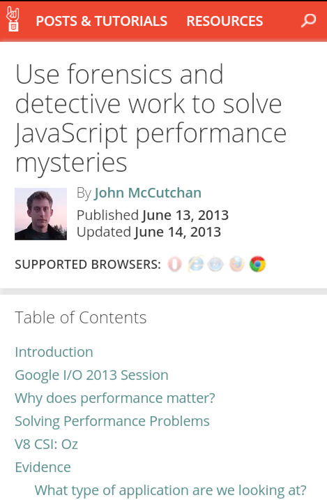
Before
This is just one example of an article, the header is in place with the title and the author, and then there is a table of contents stopping the reader from starting to read the actual article. Every article is currently like this.
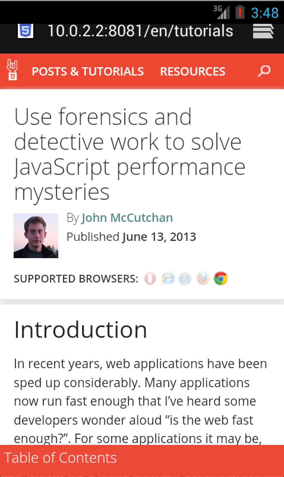
After
Now you can see that the header is still in the same place and we can start reading the content straight away. If you want to navigate around the page you can bring up the Table of Contents by clicking the bottom footer.
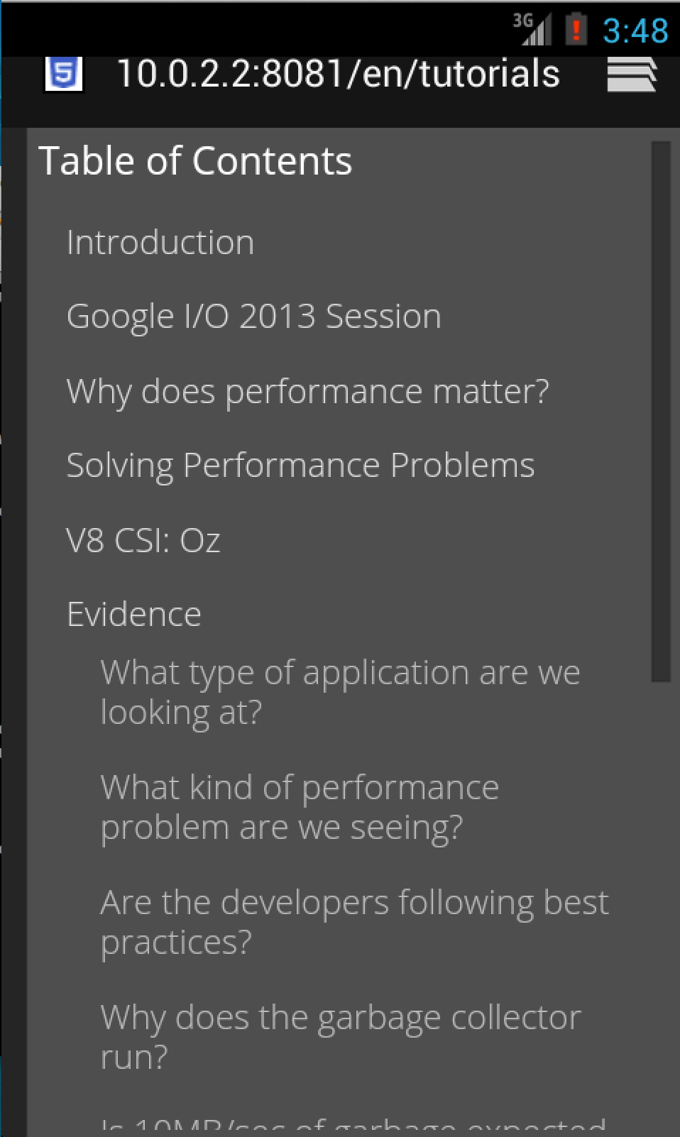
And as you can see below, the ToC is now a full screen experience, the text is larger and clearer making it easier to interact with.
Overall I am pleased with the new experience and I hoping to get it live soon. The example shown in this article is one of the larger Table of Contents and I think it holds up well even if the user has to scroll through all the headings.