
This post has been a long time coming, actually almost a year. It started with the great post "Regressive Web Apps" by Jeremy Keith, in which the lack of visible and accessible URL — based on the decisions that we (Chrome) made at the time to only offer the install prompt for sites that have either 'standalone' or 'fullscreen' — is hurting the long term health of the web.
There is some still product work happening in Chrome so that fullscreen or
standalone web apps provide the user with access to the thing that fundamentally
powers them, the url, although I am not actually sure if we loosened the
display criteria though... That all being said, at the time, I said to myself
"Everything installable should be standalone or fullscreen, so the developer
should own the URL experience, however that is hard and that means I can make a
a web component that solves this. Simples."
So a year later, I have a web component.
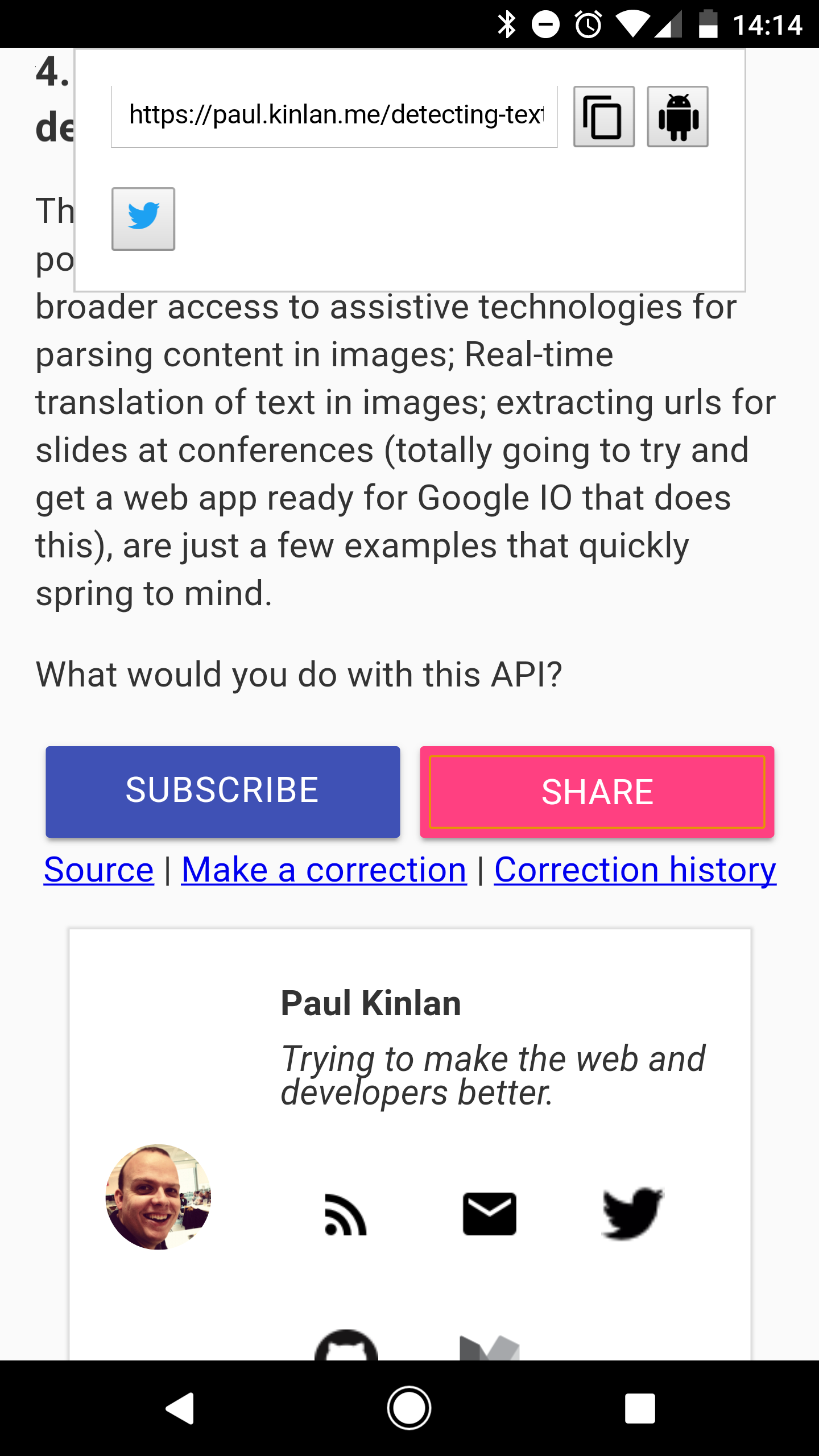
<share-button>
It solves what I wanted to solve, not what Jeremy wanted though... So, yeah. :)
It's by far still in the works, but I like it and I am using it on this site and I also wanted to share some of what I have learned along the way.
I had a number of goals for how it should be architected:
- No Polyfills, if your browser doesn't support Web Components then you have to provide a default solution.
- No external dependencies. By including my component on the page you should be in control of all the resources it requests.
I also had a number of goals for the functionality (which I will cover in more depth in another post):
- It should give the user access to the URL and allow them to edit it
- It should allow the user to copy the URL to the clipboard
- It should support any native sharing capabilities that the system has, be it
Android Intents or
navigator.share - It should be extendable so that the developer can add their own networks and share targets
- It should be styleable to fit in with the developers brand
I think I met a lot of these goals, so I have documented what I have learnt. In the rest of this post I would love to get feedback on the decisions that I made about Progressive Enhancement and Enacpsulation of the component in to a single file.
Progressive Web Components
Web component support is not ubiquitous and I don't like transpiling code for production, so this ultimately leaves me with a dilemma. If I want to use web components and I stick with my mantra of no polyfills I need to work something out.
Web Components are comprised of many technologies. Shadow DOM, Templates and Custom elements.
Custom Elements present a problem, they require ES6 classes to function
correctly and this syntax will cause an error on the page if your browser
doesn't support it.
StackOverflow
suggested a solution is to use eval to attempt to parse some simple ES-20XX
code and see if it errors. If it errors then we know the browser can't support
the what you need.
try { eval("var foo = (x)=>x+1"); }
    catch (e) { return false; }
It's a pretty neat solution, and it allowed me to build a feature detect for arrow syntax, for class syntax and also the correct version of custom elements.
<link rel="preload" href="/javascripts/share-button.js" as="script">
<script>
function canSupportCustomElements() {
    "use strict";
    if(!('customElements' in window)) return false;
    if(!('define' in window.customElements)) return false;
    try { eval("var foo = (x)=>x+1"); }
    catch (e) { return false; }
    try { eval("class foo {}"); }
    catch (e) { return false; }
    return true;
}
if(canSupportCustomElements()) {
  var script = document.createElement('script');
  script.src = "/javascripts/share-button.js";
  // I know this is not great.
  document.documentElement.appendChild(script);
}
</script>
I am doing a little bit more research on if link rel=preload is worthwhile in
this case, but my instinct was that I should let the browsers pre-scanner do its
magic by pre-fetching my required logic as early as possible and because some
of my assets are dynamically added there is no other sane method of giving the
browser these hints.
As an enapsulated element it is not progressive, instead I manage this at the page level via CSS and logical HTML structure. It's not the best but it worked.
By default the <share-button> element is hidden and the fallback is visible.
share-button {
  display: none;
}

share-button.android:defined {
  display: block;
  padding: 5px;
  margin: 5px;
  background-color: #ff4081;
  color: white;
  text-align: center;
  --share-button-background: #ff4081;
  --share-button-appearance: none;
  --share-button-border: none;
  height: 100%;
}

share-button.android:defined + a.android {
  display: none !important;
}
And the HTML as follows, has contains the two implementations, the standard
anchor and the custom element. If the custom element is defined and available
the anchor will be display: none.
<share-button class="android">
  Share
  <twitter-share-button slot="buttons"></twitter-share-button>
</share-button>
<a class="android" href="....">Share</a>
I believe I have a way to make it fully encapsulated and progressive. It involves putting the anchor as reprojected element that will get hid by the component. That way it is just one set of element declarations that can be styled and ignored when Custom Elements or JS is not available, for example:
<share-button class="android">
  <a class="android" href="....">Share</a>
  <twitter-share-button slot="buttons"></twitter-share-button>
</share-button>
I need to test this more and work out what is acceptable to users and user agents.
No dependencies and no additional tooling
I should be a responsible developer and do as much as possible to not cause performance issues for the user of my components.
My gut says that <link rel=import> whilst simple, is bad. It has the benefit
of allowing me have styles, JS and logic defined in the mediums that they are
written in but I need a lot of tooling to combine and contatenate everything so
that they are preformant.
There is a lot of great tooling for <link rel=import> but I didn't want to put
the burden on my users of having to work out how to integrate this into their
build and deployment step. I would much rather have developers just drop in a
single script into the page for each component and let their existing build
tooling work as it would normally for any JavaScript file.
Finally no other render supports imports, it pretty much means if I don't want to use polyfills I have to come up with a solution.
The model that I chose was to encapsulate everything into my ES6 class that defines the component. CSS and HTML are managed with JS and a bunch of leg work.
I have a function called _createTemplate which is called by the elements
constructor and it creates a document fragment that has a <style> element
added and two of the main controls defined. This is then attached as the
shadowRoot for the element. Once it is attached I then have some other logic
that hooks up the DOM events.
_createTemplate() {
  const framgent = document.createDocumentFragment();

  let styles = document.createElement('style');
  styles.innerHTML = `:host {
    display: inline-flex;
    --share-button-background: none;
    --share-button-border: 2px outset buttonface;
    --share-button-appearance: button;
    --share-button-border-radius: initial;
    --share-button-color: initial;
    --overlay-background-color: white;
    --overlay-background-border: 1px solid #ccc;
  ...`;

  const button = document.createElement('button');
  button.id='share-btn';
  button.innerHTML='<slot></slot>';

  const overlay = document.createElement('div');
  overlay.id = 'overlay';
  overlay.innerHTML = `
    <div id="urlbar">
      <input type="url" id="url" />
      <button id="copy" aria-label="Copy to clipboard">
        <slot name="clipboard"><img src=".."></slot>
      </button>
      <button id="android" aria-label="Share on Android">
        <slot name="android"><img src="..."></slot>
      </button>
    </div>
    <div class="buttons">
      <slot name="buttons"></slot>
    </div>`;

  framgent.appendChild(styles);
  framgent.appendChild(button);
  framgent.appendChild(overlay);

  return framgent;
}

constructor() {
  super();

  this.attachShadow({mode:'open'});
  this.shadowRoot.appendChild(this._createTemplate());
  ...
}
Syntax highlighting and linting is lost at authoring time for HTML templates and CSS and minification is harder for embedded CSS and HTML but that is for me to take the pain on and not my users.
My component has a good balance that can integrate well into developers existing build chains. I would love feedback on this area.
Styling web components is hard
I am not a very visual web developer, I work best with infrastructure and logic but even with these 'skills' styling components is very hard to do, specially providing an style based API for your component is very hard.
You really do have to know how the user of your component will want to use your component (sounds obvious when I type it). You have to know what you want the user to be able to style at a component level and then for each CSS property create a custom CSS variable and you also have to know what attributes your element to inherit from the host.
The first versions of my element only has a couple of style extension points and these are just for controlling the appearance of the button on the page.
:host {
  --share-button-background: none;
  --share-button-border: 2px outset buttonface;
  --share-button-appearance: button;
  --share-button-border-radius: initial;
  --share-button-color: initial;
}

// Element in shadow DOM
#share-btn {
  -webkit-appearance: var(--share-button-appearance);
  -moz-appearance: var(--share-button-appearance);
  appearance: var(--share-button-appearance);
  border: var(--share-button-border);
  border-radius: var(--share-button-border-radius)
}
This allows me to then override the style in my own declarations in my page.
share-button.android:defined {
  display: block;
  /* ... */
  --share-button-background: #ff4081;
  --share-button-appearance: none;
  --share-button-border: none;
}
It is incredibly verbose and it will be incredibly hard for the industry to come up with consistent guidelines for component authors to help reduce the cognitive load on developers embedding these elements.
I've no clue what the solution is, or if this is the best practice.
There is a lot more still to cover
I learned a lot building these elements that I will cover in a follow up post,
specifically <slot> and getting data between elements and also some
frustrations about the life time of child nodes.
Web components have a lot to offer the web, yet I feel there is still a lot to document and establish best practice within the industry so that embedding a reusable component is simple and performant.
All the source is up on Github for both the Share Button and Twitter Share and I would greatly appreciate any feedback.